Detailed Guide to the Bar Chart in R with ggplot
Posted on Wed 01 May 2019 in R
When it comes to data visualization, flashy graphs can be fun. Believe me, I'm as big a fan of flashy graphs as anybody. But if you're trying to convey information, especially to a broad audience, flashy isn't always the way to go.
Whether it's the line graph, scatter plot, or bar chart (the subject of this guide!), choosing a well-understood and common graph style is usually the way to go for most audiences, most of the time. And if you're just getting started with your R journey, it's important to master the basics before complicating things further.
So in this guide, I'm going to talk about creating a bar chart in R. Specifically, I'll show you exactly how you can use the ggplot geom_bar function to create a bar chart.
A bar chart is a graph that is used to show comparisons across discrete categories. One axis--the x-axis throughout this guide--shows the categories being compared, and the other axis--the y-axis in our case--represents a measured value. The heights of the bars are proportional to the measured values.
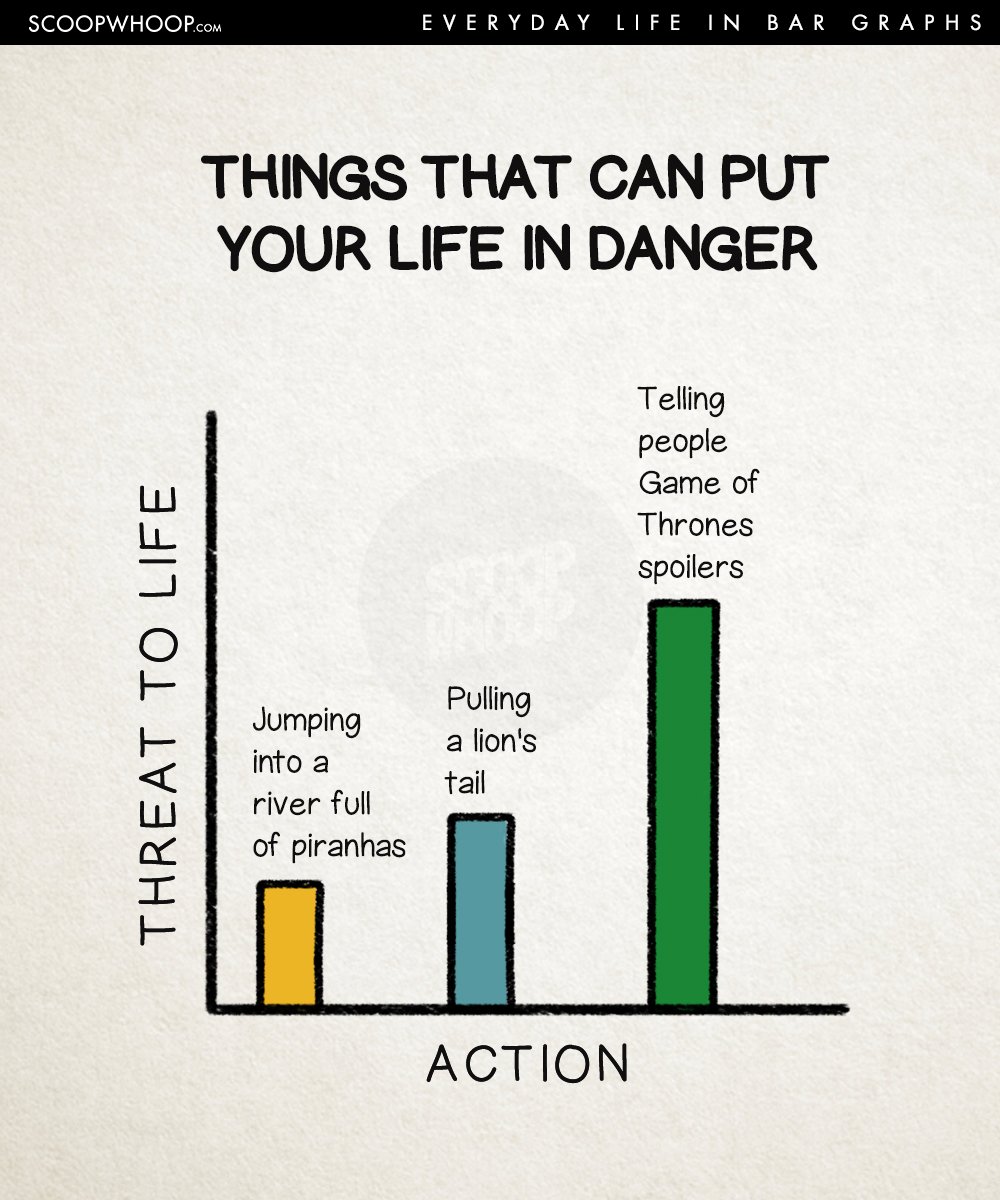
For example, in this extremely scientific bar chart, we see the level of life threatening danger for three different actions. All dangerous, to be sure, but I think we can all agree this graph gets things right in showing that Game of Thrones spoilers are most dangerous of all.
Introduction to ggplot
Before diving into the ggplot code to create a bar chart in R, I first want to briefly explain ggplot and why I think it's the best choice for graphing in R.
ggplot is a package for creating graphs in R, but it's also a method of thinking about and decomposing complex graphs into logical subunits.
ggplot takes each component of a graph--axes, scales, colors, objects, etc--and allows you to build graphs up sequentially one component at a time. You can then modify each of those components in a way that's both flexible and user-friendly. When components are unspecified, ggplot uses sensible defaults. This makes ggplot a powerful and flexible tool for creating all kinds of graphs in R. It's the tool I use to create nearly every graph I make these days, and I think you should use it too!
Follow Along With the Workbook
To accompany this guide, I've created a free workbook that you can work through to apply what you're learning as you read.
The workbook is an R file that contains all the code shown in this post as well as additional guided questions and exercises to help you understand the topic even deeper.
If you want to really learn how to create a bar chart in R so that you'll still remember weeks or even months from now, you need to practice.
So Download the workbook now and practice as you read this post!
Download your free ggplot bar chart workbook!
Investigating our dataset
Throughout this guide, we'll be using the mpg dataset that's built into ggplot. This dataset contains data on fuel economy for 38 popular car models. Let's take a look:
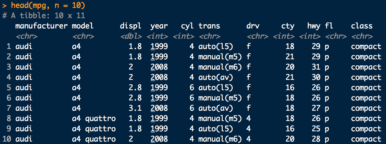
The mpg dataset contains 11 columns:
manufacturer: Car Manufacturer Namemodel: Car Model Namedispl: Engine Displacement (liters)year: Year of Manufacturecyl: Number of Cylinderstrans: Type of Transmissiondrv: f = front-wheel drive, r = rear-wheel drive, 4 = 4wdcty: City Miles per Gallonhwy: Highway Miles per Gallonfl: Fuel Typeclass: Type of Car
How to create a simple bar chart in R using geom_bar
ggplot uses geoms, or geometric objects, to form the basis of different types of graphs. Previously I have talked about geom_line for line graphs and geom_point for scatter plots. Today I'll be focusing on geom_bar, which is used to create bar charts in R.
library(tidyverse)

ggplot(mpg) +
    geom_bar(aes(x = class))
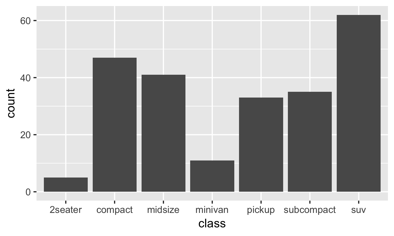
Here we are starting with the simplest possible ggplot bar chart we can create using geom_bar. Let's review this in more detail:
First, we call ggplot, which creates a new ggplot graph. Basically, this creates a blank canvas on which we'll add our data and graphics. Here we pass mpg to ggplot to indicate that we'll be using the mpg data for this particular ggplot bar chart.
Next, we add the geom_bar call to the base ggplot graph in order to create this bar chart. In ggplot, you use the + symbol to add new layers to an existing graph. In this second layer, I told ggplot to use class as the x-axis variable for the bar chart.
You'll note that we don't specify a y-axis variable here. Later on, I'll tell you how we can modify the y-axis for a bar chart in R. But for now, just know that if you don't specify anything, ggplot will automatically count the occurrences of each x-axis category in the dataset, and will display the count on the y-axis.
And that's it, we have our bar chart! We see that SUVs are the most prevalent in our data, followed by compact and midsize cars.
Changing bar color in a ggplot bar chart
Expanding on this example, let's change the colors of our bar chart!
ggplot(mpg) +
    geom_bar(aes(x = class), fill = 'blue')
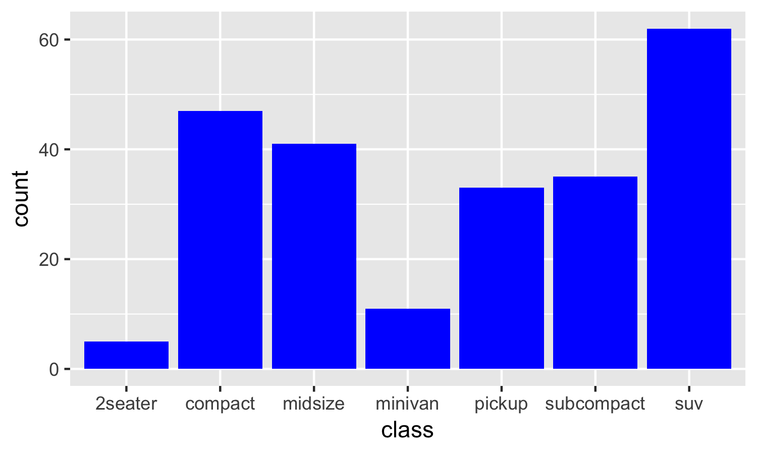
You'll note that this geom_bar call is identical to the one before, except that we've added the modifier fill = 'blue' to to end of the line. Experiment a bit with different colors to see how this works on your machine. You can use most color names you can think of, or you can use specific hex colors codes to get more granular.
If you're familiar with line graphs and scatter plots in ggplot, you've seen that in those cases we changed the color by specifing color = 'blue', while in this case we're using fill = 'blue'.
In ggplot, color is used to change the outline of an object, while fill is used to fill the inside of an object. For objects like points and lines, there is no inside to fill, so we use color to change the color of those objects. With bar charts, the bars can be filled, so we use fill to change the color with geom_bar.
This distinction between color and fill gets a bit more complex, so stick with me to hear more about how these work with bar charts in ggplot!
Mapping bar color to a variable in a ggplot bar chart
Now, let's try something a little different. Compare the ggplot code below to the code we just executed above. There are 2 differences. See if you can find them and guess what will happen, then scroll down to take a look at the result. If you've read my previous ggplot guides, this bit should look familiar!
ggplot(mpg) +
    geom_bar(aes(x = class, fill = drv))
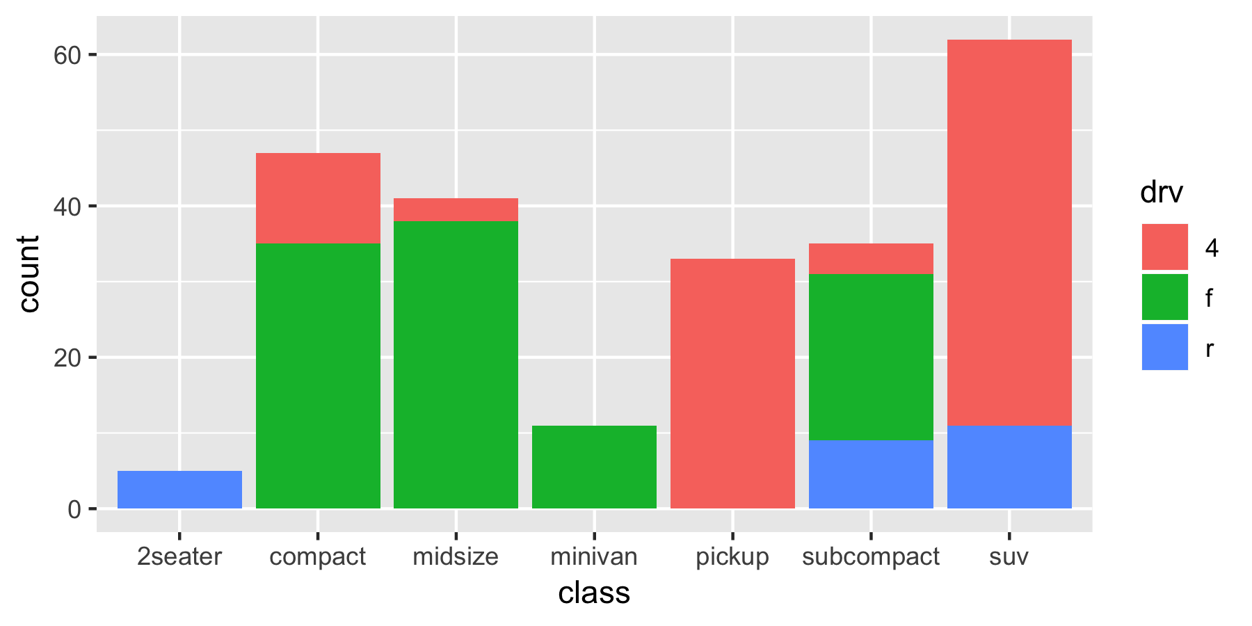
This graph shows the same data as before, but now instead of showing solid-colored bars, we now see that the bars are stacked with 3 different colors! The red portion corresponds to 4-wheel drive cars, the green to front-wheel drive cars, and the blue to rear-wheel drive cars. Did you catch the 2 changes we used to change the graph? They were:
- Instead of specifying
fill = 'blue', we specifiedfill = drv - We moved the fill parameter inside of the
aes()parentheses
Before, we told ggplot to change the color of the bars to blue by adding fill = 'blue' to our geom_bar() call.
What we're doing here is a bit more complex. Instead of specifying a single color for our bars, we're telling ggplot to map the data in the drv column to the fill aesthetic.
This means we are telling ggplot to use a different color for each value of drv in our data! This mapping also lets ggplot know that it also needs to create a legend to identify the drive types, and it places it there automatically!
More Details on Stacked Bar Charts in ggplot
As we saw above, when we map a variable to the fill aesthetic in ggplot, it creates what's called a stacked bar chart. A stacked bar chart is a variation on the typical bar chart where a bar is divided among a number of different segments.
In this case, we're dividing the bar chart into segments based on the levels of the drv variable, corresponding to the front-wheel, rear-wheel, and four-wheel drive cars.
For a given class of car, our stacked bar chart makes it easy to see how many of those cars fall into each of the 3 drv categories.
The main flaw of stacked bar charts is that they become harder to read the more segments each bar has, especially when trying to make comparisons across the x-axis (in our case, across car class). To illustrate, let's take a look at this next example:
# Note we convert the cyl variable to a factor to fill properly
ggplot(mpg) +
    geom_bar(aes(x = class, fill = factor(cyl)))
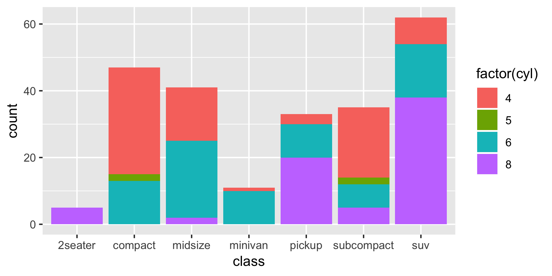
As you can see, even with four segments it starts to become difficult to make comparisons between the different categories on the x-axis. For example, are there more 6-cylinder minivans or 6-cylinder pickups in our dataset? What about 5-cylinder compacts vs. 5-cylinder subcompacts? With stacked bars, these types of comparisons become challenging. My recommendation is to generally avoid stacked bar charts with more than 3 segments.
Dodged Bars in ggplot
Instead of stacked bars, we can use side-by-side (dodged) bar charts. In ggplot, this is accomplished by using the position = position_dodge() argument as follows:
# Note we convert the cyl variable to a factor here in order to fill by cylinder
ggplot(mpg) +
    geom_bar(aes(x = class, fill = factor(cyl)), position = position_dodge(preserve = 'single'))
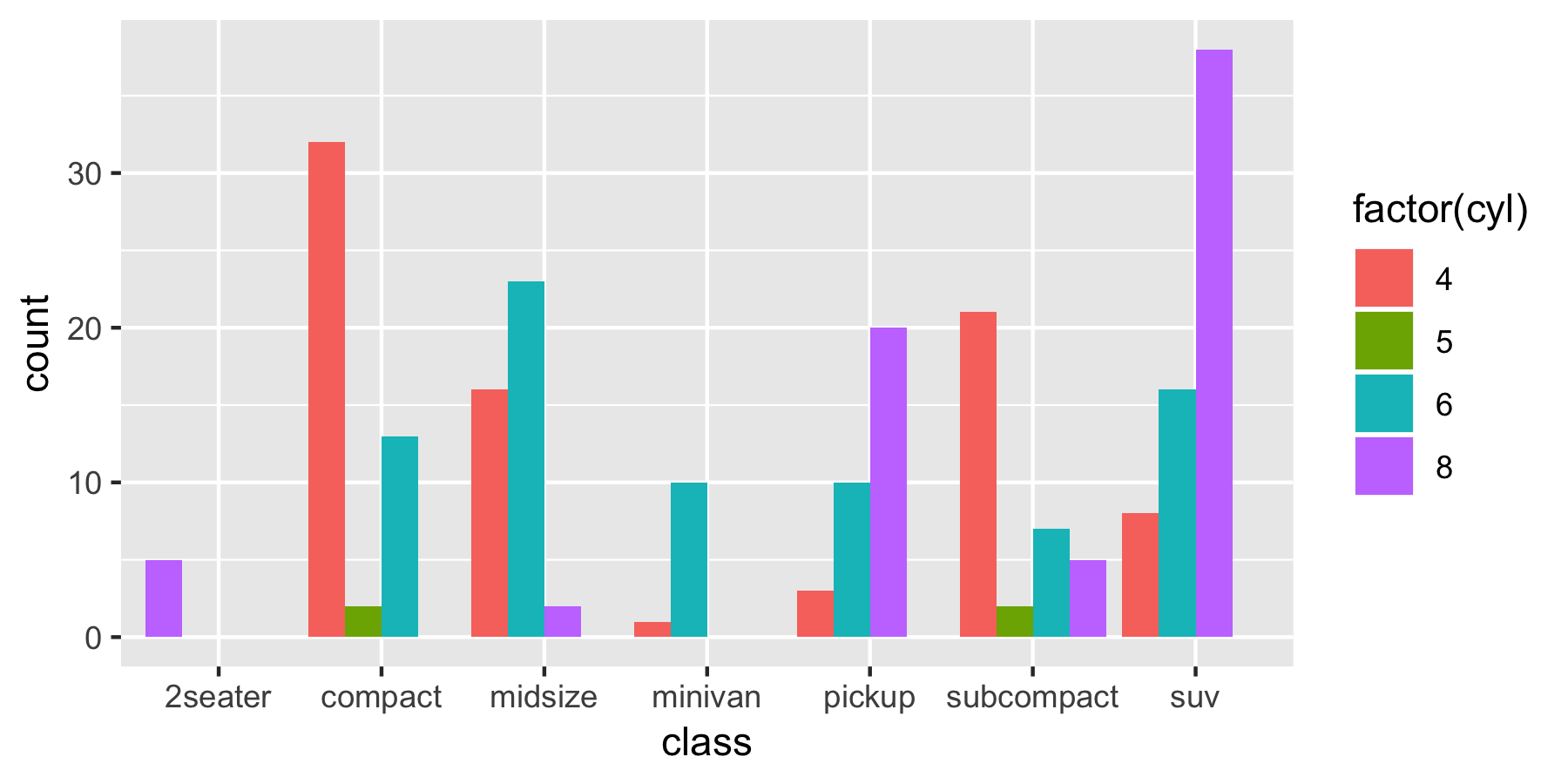
Now, the different segments for each class are placed side-by-side instead of stacked on top of each other.
Revisiting the comparisons from before, we can quickly see that there are an equal number of 6-cylinder minivans and 6-cylinder pickups. There are also an equal number of 5-cylinder compacts and subcompacts.
While these comparisons are easier with a dodged bar graph, comparing the total count of cars in each class is far more difficult.
Which brings us to a general point: different graphs serve different purposes! You shouldn't try to accomplish too much in a single graph. If you're trying to cram too much information into a single graph, you'll likely confuse your audience, and they'll take away exactly none of the information.
Scaling bar size to a variable in your data
Up to now, all of the bar charts we've reviewed have scaled the height of the bars based on the count of a variable in the dataset. First we counted the number of vehicles in each class, and then we counted the number of vehicles in each class with each drv type.
What if we don't want the height of our bars to be based on count? What if we already have a column in our dataset that we want to be used as the y-axis height? Let's say we wanted to graph the average highway miles per gallon by class of car, for example. How can we do that in ggplot?
There are two ways we can do this, and I'll be reviewing them both. To start, I'll introduce stat = 'identity':
# Use dplyr to calculate the average hwy_mpg by class
by_hwy_mpg <- mpg %>% group_by(class) %>% summarise(hwy_mpg = mean(hwy))

ggplot(by_hwy_mpg) +
    geom_bar(aes(x = class, y = hwy_mpg), stat = 'identity')

Now we see a graph by class of car where the y-axis represents the average highway miles per gallon of each class. How does this work, and how is it different from what we had before?
Before, we did not specify a y-axis variable and instead let ggplot automatically populate the y-axis with a count of our data. Now, we're explicityly telling ggplot to use hwy_mpg as our y-axis variable. And there's something else here also: stat = 'identity'. What does that mean?
We saw earlier that if we omit the y-variable, ggplot will automatically scale the heights of the bars to a count of cases in each group on the x-axis. If we instead want the values to come from a column in our data frame, we need to change two things in our geom_bar call:
- Add
stat = 'identity'togeom_bar() - Add a y-variable mapping
Adding a y-variable mapping alone without adding stat='identity' leads to an error message:

Why the error? If you don't specify stat = 'identity', then under the hood, ggplot is automatically passing a default value of stat = 'count', which graphs the counts by group. A y-variable is not compatible with this, so you get the error message.
If this is confusing, that's okay. For now, all you need to remember is that if you want to use geom_bar to map the heights of a column in your dataset, you need to add BOTH a y-variable mapping AND stat = 'identity'.
I'll be honest, this was highly confusing for me for a long time. I hope this guidance helps to clear things up for you, so you don't have to suffer the same confusion that I did. But if you have a hard time remembering this distinction, ggplot also has a handy function that does this work for you. Instead of using geom_bar with stat = 'identity', you can simply use the geom_col function to get the same result. Let's see:
# Use dplyr to calculate the average hwy_mpg by class
by_hwy_mpg <- mpg %>% group_by(class) %>% summarise(hwy_mpg = mean(hwy))

ggplot(by_hwy_mpg) +
    geom_col(aes(x = class, y = hwy_mpg))
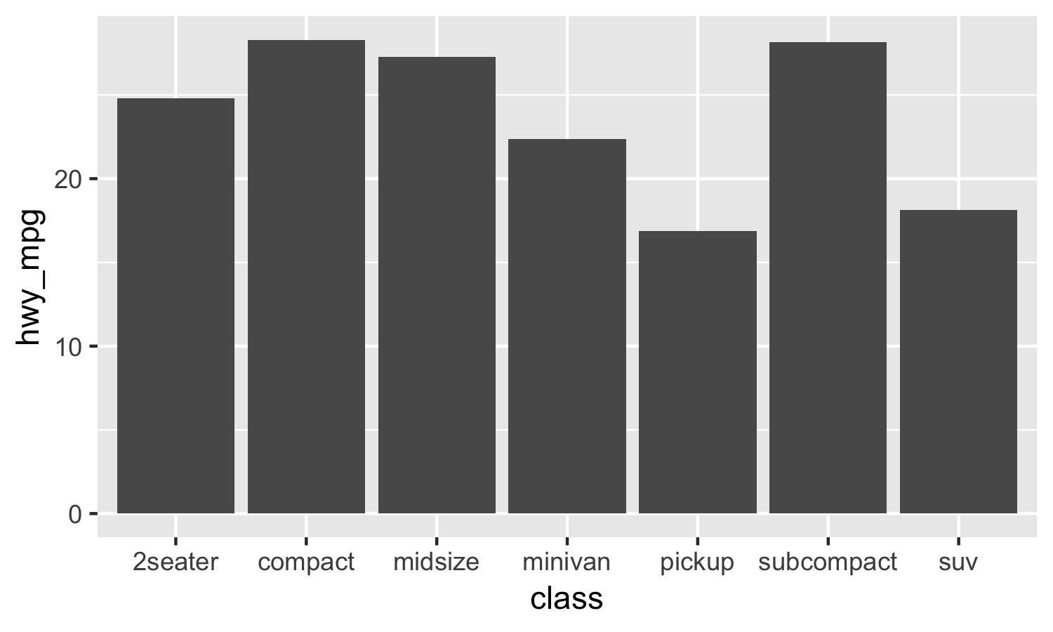
You'll notice the result is the same as the graph we made above, but we've replaced geom_bar with geom_col and removed stat = 'identity'. geom_col is the same as geom_bar with stat = 'identity', so you can use whichever you prefer or find easier to understand. For me, I've gotten used to geom_bar, so I prefer to use that, but you can do whichever you like!
Revisiting color in geom_bar
Above, we showed how you could change the color of bars in ggplot using the fill option. I mentioned that color is used for line graphs and scatter plots, but that we use fill for bars because we are filling the inside of the bar with color. That said, color does still work here, though it affects only the outline of the graph in question. Take a look:
ggplot(mpg) +
    geom_bar(aes(x = class), color = 'blue')
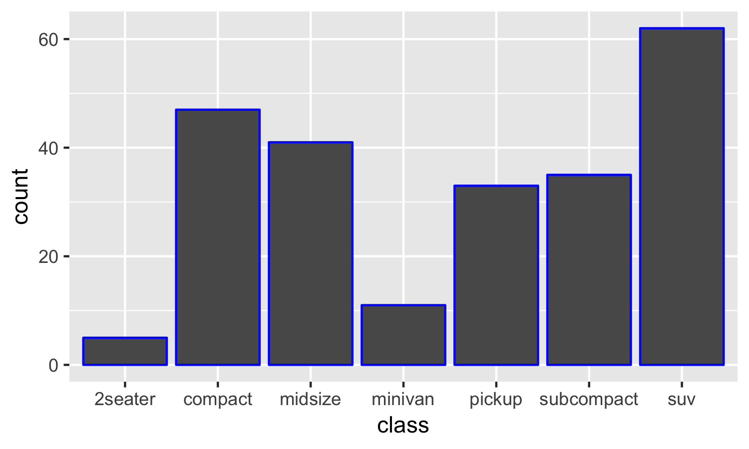
This created graphs with bars filled with the standard gray, but outlined in blue. That outline is what color affects for bar charts in ggplot!
I personally only use color for one specific thing: modifying the outline of a bar chart where I'm already using fill to create a better looking graph with a little extra pop. The standard fill is fine for most purposes, but you can step things up a bit with a carefully selected color outline:
ggplot(mpg) +
    geom_bar(aes(x = class), fill = '#003366', color = '#add8e6')
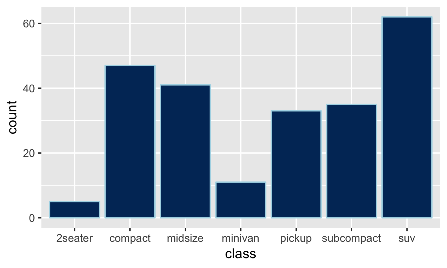
It's subtle, but this graph uses a darker navy blue for the fill of the bars and a lighter blue for the outline that makes the bars pop a little bit.
This is the only time when I use color for bar charts in R. Do you have a use case for this? I'd love to hear it, so let me know in the comments!
A deeper review of aes() (aesthetic) mappings in ggplot
We saw above how we can create graphs in ggplot that use the fill argument map the cyl variable or the drv variable to the color of bars in a bar chart. ggplot refers to these mappings as aesthetic mappings, and they include everything you see within the aes() in ggplot.
Aesthetic mappings are a way of mapping variables in your data to particular visual properties (aesthetics) of a graph.
I know this can sound a bit theoretical, so let's review the specific aesthetic mappings you've already seen as well as the other mappings available within geom_bar.
Reviewing the list of geom_bar aesthetic mappings
The main aesthetic mappings for a ggplot bar graph include:
x: Map a variable to a position on the x-axisy: Map a variable to a position on the y-axisfill: Map a variable to a bar colorcolor: Map a variable to a bar outline colorlinetype: Map a variable to a bar outline linetypealpha: Map a variable to a bar transparency
From the list above, we've already seen the x and fill aesthetic mappings. We've also seen color applied as a parameter to change the outline of the bars in the prior example.
I'm not going to review the additional aesthetics in this post, but if you'd like more details, check out the free workbook which includes some examples of these aesthetics in more detail!
Download your free ggplot bar chart workbook!
Aesthetic mappings vs. parameters in ggplot
I often hear from my R training clients that they are confused by the distinction between aesthetic mappings and parameters in ggplot. Personally, I was quite confused by this when I was first learning about graphing in ggplot as well. Let me try to clear up some of the confusion!
Above, we saw that we could use fill in two different ways with geom_bar. First, we were able to set the color of our bars to blue by specifying fill = 'blue' outside of our aes() mappings. Then, we were able to map the variable drv to the color of our bars by specifying fill = drv inside of our aes() mappings.
What is the difference between these two ways of working with fill and other aesthetic mappings?
When you include fill, color, or another aesthetic inside the aes() of your ggplot code, you're telling ggplot to map a variable to that aesthetic in your graph. This is what we did when we said fill = drv above to fill different drive types with different colors.
Each of the aesthetic mappings you've seen can also be used as a parameter, that is, a fixed value defined outside of the aes() aesthetic mappings. You saw how to do this with fill when we made the bar chart bars blue with fill = 'blue'. You also saw how we could outline the bars with a specific color when we used color = '#add8e6'.
Whenever you're trying to map a variable in your data to an aesthetic to your graph, you want to specify that inside the aes() function. And whenever you're trying to hardcode a specific parameter in your graph (making the bars blue, for example), you want to specify that outside the aes() function. I hope this helps to clear up any confusion you have on the distinction between aesthetic mappings and parameters!
Common errors with aesthetic mappings and parameters in ggplot
When I was first learning R and ggplot, this difference between aesthetic mappings (the values included inside your aes()), and parameters (the ones outside your aes()) was constantly confusing me. Luckily, over time, you'll find that this becomes second nature. But in the meantime, I can help you speed along this process with a few common errors that you can keep an eye out for.
Trying to include aesthetic mappings outside your aes() call
If you're trying to map the drv variable to fill, you should include fill = drv within the aes() of your geom_bar call. What happens if you include it outside accidentally, and instead run ggplot(mpg) + geom_bar(aes(x = class), fill = drv)? You'll get an error message that looks like this:

Whenever you see this error about object not found, be sure to check that you're including your aesthetic mappings inside the aes() call!
Trying to specify parameters inside your aes() call
On the other hand, if we try including a specific parameter value (for example, fill = 'blue') inside of the aes() mapping, the error is a bit less obvious. Take a look:
ggplot(mpg) +
    geom_bar(aes(x = class, fill = 'blue'))
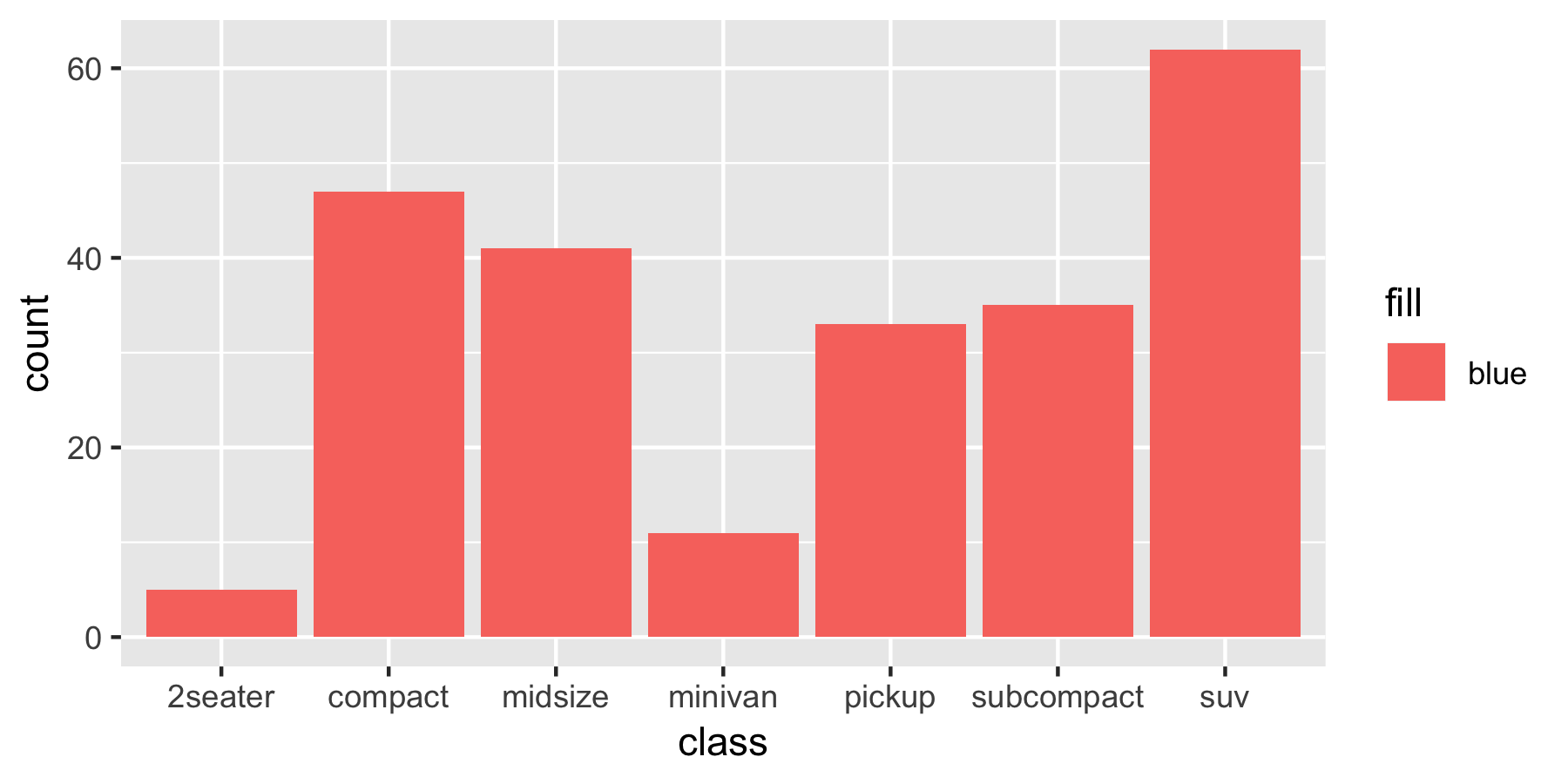
In this case, ggplot actually does produce a bar chart, but it's not what we intended.
For starters, the bars in our bar chart are all red instead of the blue we were hoping for! Also, there's a legend to the side of our bar graph that simply says 'blue'.
What's going on here? Under the hood, ggplot has taken the string 'blue' and created a new hidden column of data where every value simple says 'blue'. Then, it's mapped that column to the fill aesthetic, like we saw before when we specified fill = drv. This results in the legend label and the color of all the bars being set, not to blue, but to the default color in ggplot.
If this is confusing, that's okay for now. Just remember: when you run into issues like this, double check to make sure you're including the parameters of your graph outside your aes() call!
You should now have a solid understanding of how to create a bar chart in R using the ggplot bar chart function, geom_bar!
Solidify Your Understanding
Experiment with the things you've learned to solidify your understanding. You can download my free workbook with the code from this article to work through on your own.
I've found that working through code on my own is the best way for me to learn new topics so that I'll actually remember them when I need to do things on my own in the future.