A Detailed Guide to Plotting Line Graphs in R using ggplot geom_line
Posted on Wed 17 April 2019 in R
When it comes to data visualization, it can be fun to think of all the flashy and exciting ways to display a dataset. But if you're trying to convey information, flashy isn't always the way to go.
In fact, in most cases, simplicity is key to making your audience understand your data. Whether it's scatter plots, bar graphs, or line graphs (the subject of this post!), common graph types make things easy for your audience, which means you can more easily share your message.
Right now, we're talking about line graphs. A line graph is a type of graph that displays information as a series of data points connected by straight line segments.
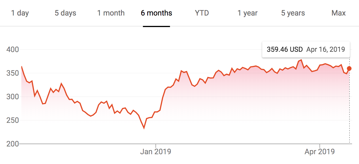
The price of Netflix stock (NFLX) displayed as a line graph
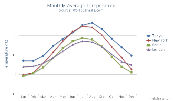
Line graph of average monthly temperatures for four major cities
There are many different ways to use R to plot line graphs, but the one I prefer is the ggplot geom_line function.
Introduction to ggplot
Before we dig into creating line graphs with the ggplot geom_line function, I want to briefly touch on ggplot and why I think it's the best choice for plotting graphs in R.
ggplot is a package for creating graphs in R, but it's also a method of thinking about and decomposing complex graphs into logical subunits.
ggplot takes each component of a graph--axes, scales, colors, objects, etc--and allows you to build graphs up sequentially one component at a time. You can then modify each of those components in a way that's both flexible and user-friendly. When components are unspecified, ggplot uses sensible defaults. This makes ggplot a powerful and flexible tool for creating all kinds of graphs in R. It's the tool I use to create nearly every graph I make these days, and I think you should use it too!
Investigating our dataset
Throughout this post, we'll be using the Orange dataset that's built into R. This dataset contains information on the age and circumference of 5 different orange trees, letting us see how these trees grow over time. Let's take a look at this dataset to see what it looks like:
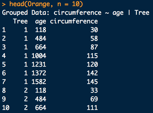
The dataset contains 3 columns: Tree, age, and cimcumference. There are 7 observations for each Tree, and there are 5 Trees, for a total of 35 observations in all.
Simple example of ggplot + geom_line()
library(tidyverse)

# Filter the data we need
tree_1 <- filter(Orange, Tree == 1)

# Graph the data
ggplot(tree_1) +
    geom_line(aes(x = age, y = circumference))

Here we are starting with the simplest possible line graph using geom_line. For this simple graph, I chose to only graph the size of the first tree. I used dplyr to filter the dataset to only that first tree.
If you're not familiar with dplyr's filter function, it's my preferred way of subsetting a dataset in R, and I recently wrote an in-depth guide to dplyr filter if you'd like to learn more!
Once I had filtered out the dataset I was interested in, I then used ggplot + geom_line() to create the graph. Let's review this in more detail:
First, I call ggplot, which creates a new ggplot graph. It's essentially a blank canvas on which we'll add our data and graphics. In this case, I passed tree_1 to ggplot, indicating that we'll be using the tree_1 data for this particular ggplot graph.
Next, I added my geom_line call to the base ggplot graph in order to create this line. In ggplot, you use the + symbol to add new layers to an existing graph. In this second layer, I told ggplot to use age as the x-axis variable and circumference as the y-axis variable.
And that's it, we have our line graph!
Changing line color in ggplot + geom_line
Expanding on this example, let's now experiment a bit with colors.
# Filter the data we need
tree_1 <- filter(Orange, Tree == 1)

# Graph the data
ggplot(tree_1) +
    geom_line(aes(x = age, y = circumference), color = 'red')

You'll note that this geom_line call is identical to the one before, except that we've added the modifier color = 'red' to to end of the line. Experiment a bit with different colors to see how this works on your machine. You can use most color names you can think of, or you can use specific hex colors codes to get more granular.
Now, let's try something a little different. Compare the ggplot code below to the code we just executed above. There are 3 differences. See if you can find them and guess what will happen, then scroll down to take a look at the result.
# Graph different data
ggplot(Orange) +
    geom_line(aes(x = age, y = circumference, color = Tree))

This line graph is quite different from the one we produced above, but we only made a few minor modifications to the code! Did you catch the 3 changes? They were:
- The dataset changed from tree_1 (our filtered dataset) to the complete Orange dataset
- Instead of specifying
color = 'red', we specifiedcolor = Tree - We moved the color parameter inside of the
aes()parentheses
Let's review each of these changes:
Moving from tree_1 to Orange
This change is relatively straightforward. Instead of only graphing the data for a single tree, we wanted to graph the data for all 5 trees. We accomplish this by changing our input dataset in the ggplot() call.
Specifying color = Tree and moving it within the aes() parentheses
I'm combining these because these two changes work together.
Before, we told ggplot to change the color of the line to red by adding color = 'red' to our geom_line() call.
What we're doing here is a bit more complex. Instead of specifying a single color for our line, we're telling ggplot to map the data in the Tree column to the color aesthetic.
Effectively, we're telling ggplot to use a different color for each tree in our data! This mapping also lets ggplot know that it also needs to create a legend to identify the trees, and it places it there automatically!
Changing linetype in ggplot + geom_line
Let's look at a related example. This time, instead of changing the color of the line graph, we will change the linetype:
ggplot(Orange) +
    geom_line(aes(x = age, y = circumference, linetype = Tree))

This ggplot + geom_line() call is identical to the one we just reviewed, except we've substituted linetype for color. The graph produced is quite similar, but it uses different linetypes instead of different colors in the graph. You might consider using something like this when printing in black and white, for example.
A deeper review of aes() (aesthetic) mappings in ggplot
We just saw how we can create graphs in ggplot that map the Tree variable to color or linetype in a line graph. ggplot refers to these mappings as aesthetic mappings, and they encompass everything you see within the aes() in ggplot.
Aesthetic mappings are a way of mapping variables in your data to particular visual properties (aesthetics) of a graph.
This might all sound a bit theoretical, so let's review the specific aesthetic mappings you've already seen as well as the other mappings available within geom_line.
Reviewing the list of geom_line aesthetic mappings
The main aesthetic mappings for ggplot + geom_line() include:
x: Map a variable to a position on the x-axisy: Map a variable to a position on the y-axiscolor: Map a variable to a line colorlinetype: Map a variable to a linetypegroup: Map a variable to a group (each group on a separate line)size: Map a variable to a line sizealpha: Map a variable to a line transparency
From the list above, we've already seen the x, y, color, and linetype aesthetic mappings.
x and y are what we used in our first ggplot + geom_line() function call to map the variables age and circumference to x-axis and y-axis values. Then, we experimented with using color and linetype to map the Tree variable to different colored lines or linetypes.
In addition to those, there are 3 other main aesthetic mappings often used with geom_line.
The group mapping allows us to map a variable to different groups. Within geom_line, that means mapping a variable to different lines. Think of it as a pared down version of the color and linetype aesthetic mappings you already saw. While the color aesthetic mapped each Tree to a different line with a different color, the group aesthetic maps each Tree to a different line, but does not differentiate the lines by color or anything else. Let's take a look:
Changing the group aesthetic mapping in ggplot + geom_line
ggplot(Orange) +
    geom_line(aes(x = age, y = circumference, group = Tree))

You'll note that the 5 lines are separated as before, but the lines are all black and there is no legend differentiating them. Depending on the data you're working with, this may or may not be appropriate. It's up to you as the person familiar with the data to determine how best to represent it in graph form!
In our Orange tree dataset, if you're interested in investigating how specific orange trees grew over time, you'd want to use the color or linetype aesthetics to make sure you can track the progress for specific trees. If, instead, you're interested in only how orange trees in general grow, then using the group aesthetic is appropriate, simplifying your graph and discarding unnecessary detail.
ggplot is both flexible and powerful, but it's up to you to design a graph that communicates what you want to show. Just because you can do something doesn't mean you should. You should always think about what message you're trying to convey with a graph, then design from those principles.
Keep this in mind as we review the next two aesthetics. While these aesthetics absolutely have a place in data visualization, in the case of the particular dataset we're working with, they don't make very much sense. But this is a guide to using geom_line in ggplot, not graphing the growth of Orange trees, so I'm still going to cover them for the sake of completeness!
Changing transparency in ggplot + geom_line with the alpha aesthetic
ggplot(Orange) +
    geom_line(aes(x = age, y = circumference, alpha = Tree))

Here we map the Tree variable to the alpha aesthetic, which controls the transparency of the line. As you can see, certain lines are more transparent than others. In this case, transparency does not add to our understanding of the graph, so I would not use this to illustrate this dataset.
Changing the size aesthetic mapping in ggplot + geom_line
ggplot(Orange) +
    geom_line(aes(x = age, y = circumference, size = Tree))

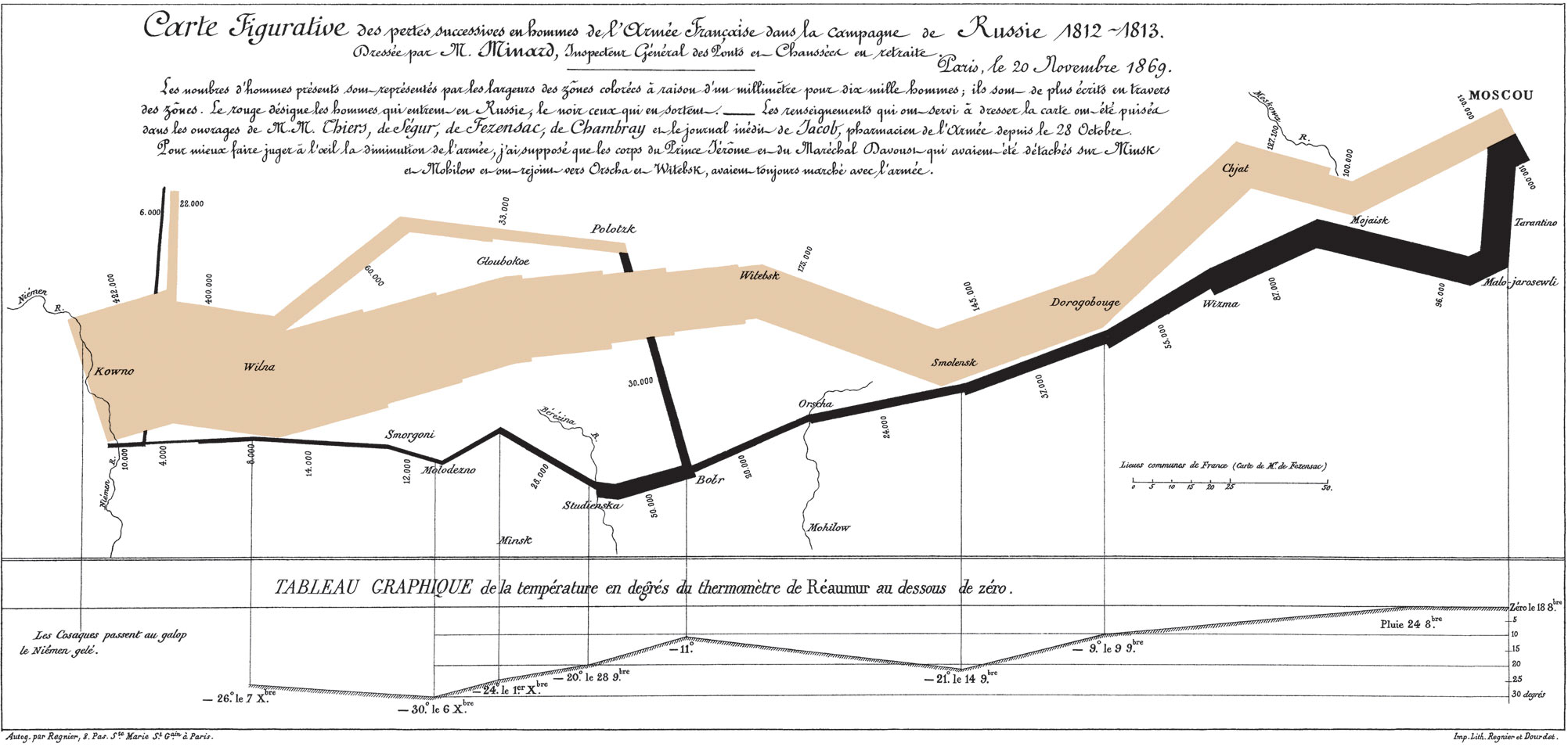
Finally, we turn to the size aesthetic, which controls the size of lines. Again, I would say this is not does not add to our understanding of our data in this context. That said, it does slightly resemble Charles Joseph Minard's famous graph of the death tolls of Napoleon's disastrous 1812 Russia Campaign, so that's kind of cool:
Aesthetic mappings vs. parameters in ggplot
Before, we saw that we are able to use color in two different ways with geom_line. First, we were able to set the color of a line to red by specifying color = 'red' outside of our aes() mappings. Then, we were able to map the variable Tree to color by specifying color = Tree inside of our aes() mappings. How does this work with all of the other aesthetics you just learned about?
Essentially, they all work the same as color! That's the beautiful thing about graphing in ggplot--once you understand the syntax, it's very easy to expand your capabilities.
Each of the aesthetic mappings you've seen can also be used as a parameter, that is, a fixed value defined outside of the aes() aesthetic mappings. You saw how to do this with color when we set the line to red with color = 'red' before. Now let's look at an example of how to do this with linetype in the same manner:
ggplot(Orange) +
    geom_line(aes(x = age, y = circumference, group = Tree), linetype = 'dotted')

To review what values linetype, size, and alpha accept, just run ?linetype, ?size, or ?alpha from your console window!
Common errors with aesthetic mappings and parameters in ggplot
When I was getting started with R and ggplot, the distinction between aesthetic mappings (the values included inside your aes()), and parameters (the ones outside your aes() was the concept that tripped me up the most. You'll learn how to deal with these issues over time, but I can help you speed along this process with a few common errors that you can keep an eye out for.
Trying to include aesthetic mappings outside your aes() call
If you're trying to map the Tree variable to linetype, you should include linetype = tree within the aes() of your geom_line call. What happens if you accidentally include it outside, and instead run ggplot(Orange) + geom_line(aes(x = age, y = circumference), linetype = Tree)? You'll get an error message that looks like this:

Whenever you see this error about object not found, make sure you check and make sure you're including your aesthetic mappings inside the aes() call!
Trying to specify parameters inside your aes() call
Alternatively, if we try to specify a specific parameter value (for example, color = 'red') inside of the aes() mapping, we get a less intutive issue:
ggplot(Orange) +
    geom_line(aes(x = age, y = circumference, color = 'red'))

In this case, ggplot actually does produce a line graph (success!), but it doesn't have the result we intended. The graph it produces looks odd, because it is putting the values for all 5 trees on a single line, rather than on 5 separate lines like we had before. It did change the color to red, but it also included a legend that simply says 'red'. When you run into issues like this, double check to make sure you're including the parameters of your graph outside your aes() call!
You should now have a solid understanding of how to use R to plot line graphs using ggplot and geom_line! Experiment with the things you've learned to solidify your understanding. As an exercise, try producing a line graph of your own using a different dataset and at least one of the aesthetic mappings you learned about. Leave your graph in the comments or email it to me at mt.toth@gmail.com -- I'd love to take a look at what you produce!
Did you find this post useful? I frequently write tutorials like this one to help you learn new skills and improve your data science. If you want to be notified of new tutorials, sign up here!