How to Create a Bar Chart Race in R - Mapping United States City Population 1790-2010
Posted on Thu 04 April 2019 in R
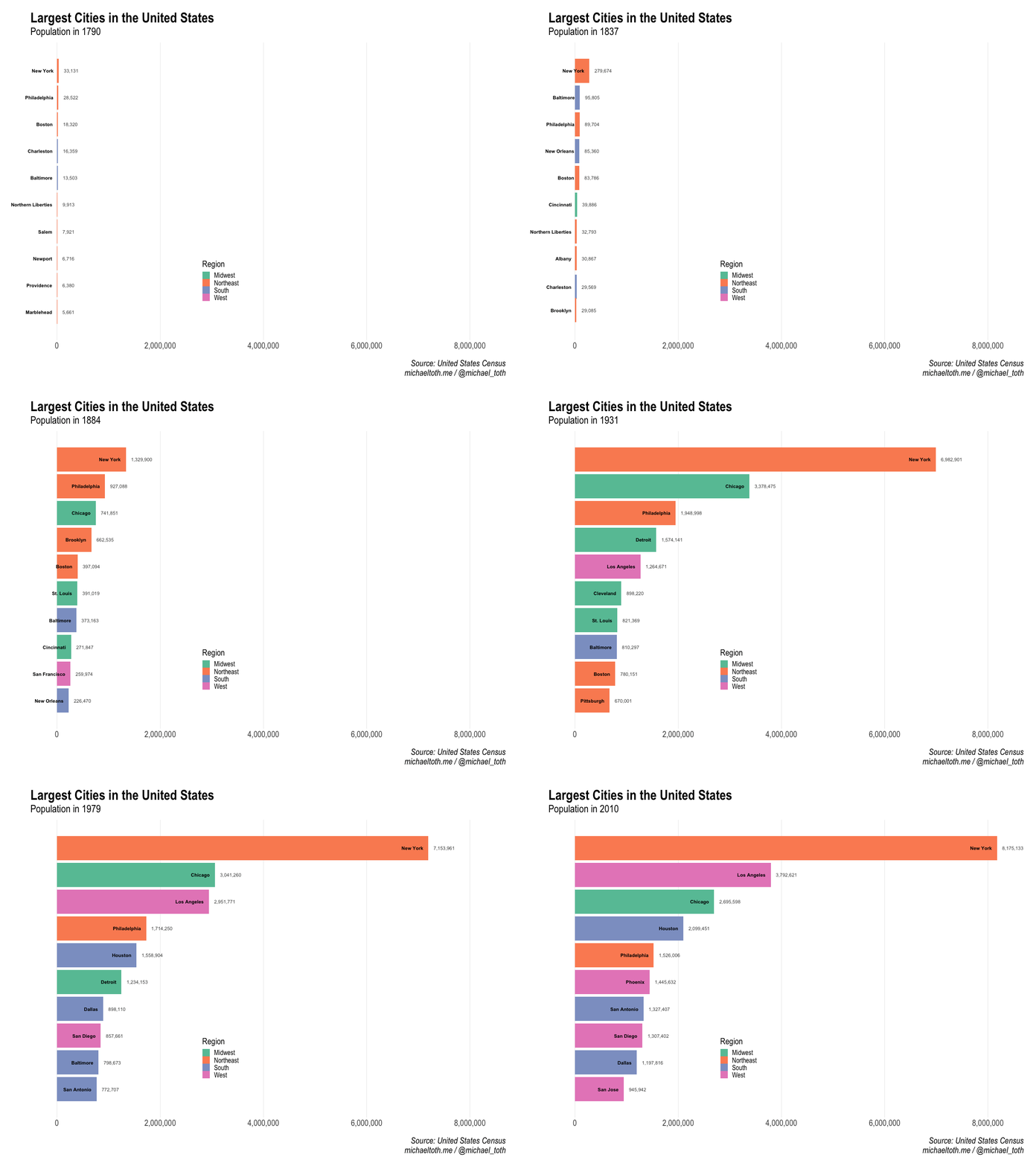
In my corner of the internet, there's been an explosion over the last several months of a style of graph called a bar chart race. Essentially, a bar chart race shows how a ranked list of something--largest cities, most valuable companies, most-followed Youtube channels--evolves over time. Maybe you've been following this trend with the same curiosity that I have, and that's how you made your way here. Or maybe you're a normal person who doesn't even know what I'm talking about! Who knows, anything is possible. By way of introduction, here is the bar chart race I've created on the largest cities in the United States over time:

Motivation for this post
For me, it all started with this brand value graphic that went viral back in February. For a few days, it felt like this thing was everywhere. And as this went viral, data visualization practitioners all started to try their hand at creating new versions of this on their own. One of my favorites was this bar chart race of world cities created by John Murdoch, who, as far as I can tell, was the person who coined the term bar chart race.
Of course, I knew that I wanted to try to create a version of this graph in R. And for as long as I an remember, I've been obsessed with looking at population statistics for cities. I remember finding an Almanac (!) on my dad's bookshelf as a kid and memorizing the list of the largest cities in the United States.
Later, I remember reading that Detroit had at a time been among the largest cities in the country. From 1916 to 1944, Detroit was the fourth largest city in the country. Its population peaked at 1.85 million in 1950. Today its population is estimated to be 673,000. The history of Detroit's population in particular was interesting to me. Having grown up Toledo, Ohio, 60 miles south of Detroit, I'd seen the effects of Detroit's dramatic population decrease first-hand. I wanted to see how this story played out in the data, and what other interesting trends would be unearthed.
So when I decided I wanted to create a bar chart race, I knew the subject I was going to study. If you're here to learn how to create a bar chart race in R, you're in the right place! Now, let's get into it!
Loading packages and data
We start by loading the packages we'll use to create the graph. gganimate provides the toolkit for animation, tidyverse will help with data processing and graphing, and hrbrthemes provides a nice-looking base graphing theme.
library(gganimate)
library(hrbrthemes)
library(tidyverse)
Now we load in some preprocessed census population data, based on decadal U.S. Census data from 1790 - 2010. This combines the data all into one large dataset we will be using for this analysis.
# Read in Census datasets by year that I downloaded and stored locally
all_data <- data.frame()
for(year in seq(1790, 2010, 10)) {
    data_path <- paste0('~/dev/michaeltoth/content/data/city_populations/', year, '.csv')
    data <- read_csv(data_path)
    data <- data[1:5]
    colnames(data) <- c('Rank', 'City', 'State', 'Population', 'Region')
    data$year <- year
    all_data <- rbind(all_data, data)
}

# The datasets were inconcistent with state naming, sometimes using full names
# And sometimes abbreviations. This code standardizes on state names:
all_data$State_From_Abbrev <- state.name[match(all_data$State,state.abb)]
all_data <- all_data %>% mutate(State = case_when(is.na(State_From_Abbrev) ~ State,
                                                  TRUE ~ State_From_Abbrev)) %>%
                         select(-State_From_Abbrev)
Interpolating missing values between census readings
Here I'm going to make some adjustments to the datasets I'm using to get them in a format I want to work with. There are 2 things in particular I want to accomplish:
- The datasets only contain information at decade intervals. I want yearly data, so I'm going to create blank entries for intermediate years that I'll later fill with linear interpolation.
- The datasets generally contain the 100 most populous cities, but I only care about the top 10 at any given time, so I'm going to discard any cities that don't at some point crack the top 10.
# Get the list of cities that were at some point in the top 10 by population
top_cities <- all_data %>% filter(Rank <= 10) %>%
    select(City, State, Region) %>% distinct()

# Generate a list of all years from 1790 - 2010
all_years <- data.frame(year = seq(1790, 2010, 1))

# Create all combinations of city and year we'll need for our final dataset
all_combos <- merge(top_cities, all_years, all = T)

# This accomplishes 2 things:
# 1. Filters out cities that are not ever in the top 10
# 2. Adds rows for all years (currently blank) to our existing dataset for each city
all_data_interp <- merge(all_data, all_combos, all.y = T)
Next, I'll use linear interpolation to calculate an estimate of city populations in between the census readings each 10 years. This isn't strictly necessary, but I think it produces a more interesting final graphic than using only the official census statistics.
all_data_interp <- all_data_interp %>%
    group_by(City) %>%
    mutate(Population=approx(year,Population,year)$y)
Last step before we graph! Here we calculate the ranked list of the top 10 cities for each year, then filter so only those cities remain in the data for that year.
data <- all_data_interp %>%
    group_by(year) %>%
    arrange(-Population) %>%
    mutate(rank=row_number()) %>%
    filter(rank<=10)
Animating the bar chart race in R
Finally, we create the graph! This piece of code looks a bit intimadating, but mostly it's formatting for the graph. Much of the core code here comes from This code by Steven Burr, which was very helpful as I tried to figure out how best to use gganimate for this purpose. The key points to call out:
- I use geom_tile, not geom_bar as this allows for better transitions within gganimate
- The gganimate functions transition_time and ease_aes handle the animation and transition between bars. The settings here worked well for my purposes, but dig into these functions to get an overview of different options
- The nframes and fps parameters to the animate function control the speed of transitions. One mistake I made here initially was to set nframes equal to the number of years in the dataset. This works, but because there is only 1 frame per year, you don't get the smooth transitions that I wanted in this graph. Increasing the number of frames fixed that issue.
p <- data %>%
    ggplot(aes(x = -rank,y = Population, group = City)) +
        geom_tile(aes(y = Population / 2, height = Population, fill = Region), width = 0.9) +
        geom_text(aes(label = City), hjust = "right", colour = "black", fontface = "bold", nudge_y = -100000) +
        geom_text(aes(label = scales::comma(Population)), hjust = "left", nudge_y = 100000, colour = "grey30") +
        coord_flip(clip="off") +
        scale_fill_manual(name = 'Region', values = c("#66c2a5", "#fc8d62", "#8da0cb", "#e78ac3")) +
        scale_x_discrete("") +
        scale_y_continuous("",labels=scales::comma) +
        hrbrthemes::theme_ipsum(plot_title_size = 32, subtitle_size = 24, caption_size = 20, base_size = 20) +
        theme(panel.grid.major.y=element_blank(),
              panel.grid.minor.x=element_blank(),
              legend.position = c(0.4, 0.2),
              plot.margin = margin(1,1,1,2,"cm"),
              axis.text.y=element_blank()) +
        # gganimate code to transition by year:
        transition_time(year) +
        ease_aes('cubic-in-out') +
        labs(title='Largest Cities in the United States',
             subtitle='Population in {round(frame_time,0)}',
             caption='Source: United States Census
michaeltoth.me / @michael_toth')

animate(p, nframes = 750, fps = 25, end_pause = 50, width = 1200, height = 900)

And there we have it! If you end up creating a bar chart race of your own, please share it in the comments - I'd love to take a look!
Did you find this post useful? I frequently write tutorials like this one to help you learn new skills and improve your data science. If you want to be notified of new tutorials, sign up here!
I help technology companies to leverage their data to produce branded, influential content to share with their clients. I work on everything from investor newsletters to blog posts to research papers. If you enjoy the work I do and are interested in working together, you can visit my consulting website or contact me at michael@michaeltothanalytics.com!