A Detailed Guide to ggplot colors
Posted on Tue 14 May 2019 in R
Once you've figured out how to create the standard scatter plots, bar charts, and line graphs in ggplot, the next step to really elevate your graphs is to master working with color.
Strategic use of color can really help your graphs to stand out and make an impact.
In this guide, you'll learn how to incorporate your own custom color palettes into your graphs by modifying the base ggplot colors.
By the end of this tutorial, you’ll know how to:
- Change all items in a graph to a static color of your choice
- Differentiate between setting a static color and mapping a variable in your data to a color palette so that each color represents a different level of the variable
- Customize your own continuous color palettes using the
scale_color_gradient,scale_fill_gradient,scale_color_gradient2, andscale_fill_gradient2functions - Customize your own color palettes for categorical data using the
scale_color_manualandscale_fill_manualfunctions
Introducing video tutorials!
I'm also excited to try something new in this guide! I'll be adding video tutorials to accompany the content, so please let me know what you think about these and if you find them helpful. I'd love to do more of this in the future if you find them valuable!
Get my free workbook to build a deeper understanding of ggplot colors!
Have you ever read a tutorial or guide, learned a bunch of interesting things, only to forget them shortly after you finish reading?
Me too. And it's really annoying!
Unfortunately, our brains aren't good at remembering what we read. We need to think critically and be engaged in solving problems to learn information so it sticks.
That's why I've created a free workbook to accompany this post. The workbook is an R file that includes additional questions and exercises to help you engage with this material.
Get your free workbook to master working with colors in ggplot
A high-level overview of ggplot colors
By default, ggplot graphs use a black color for lines and points and a gray color for shapes like the rectangles in bar graphs.
Sometimes this is fine for your purposes, but often you'll want to modify these colors to something different.
Depending on the type of graph you're working with, there are two primary attributes that affect the colors in a graph.
You use the color attribute to change the outline of a shape and you use the fill attribute to fill the inside of a shape.
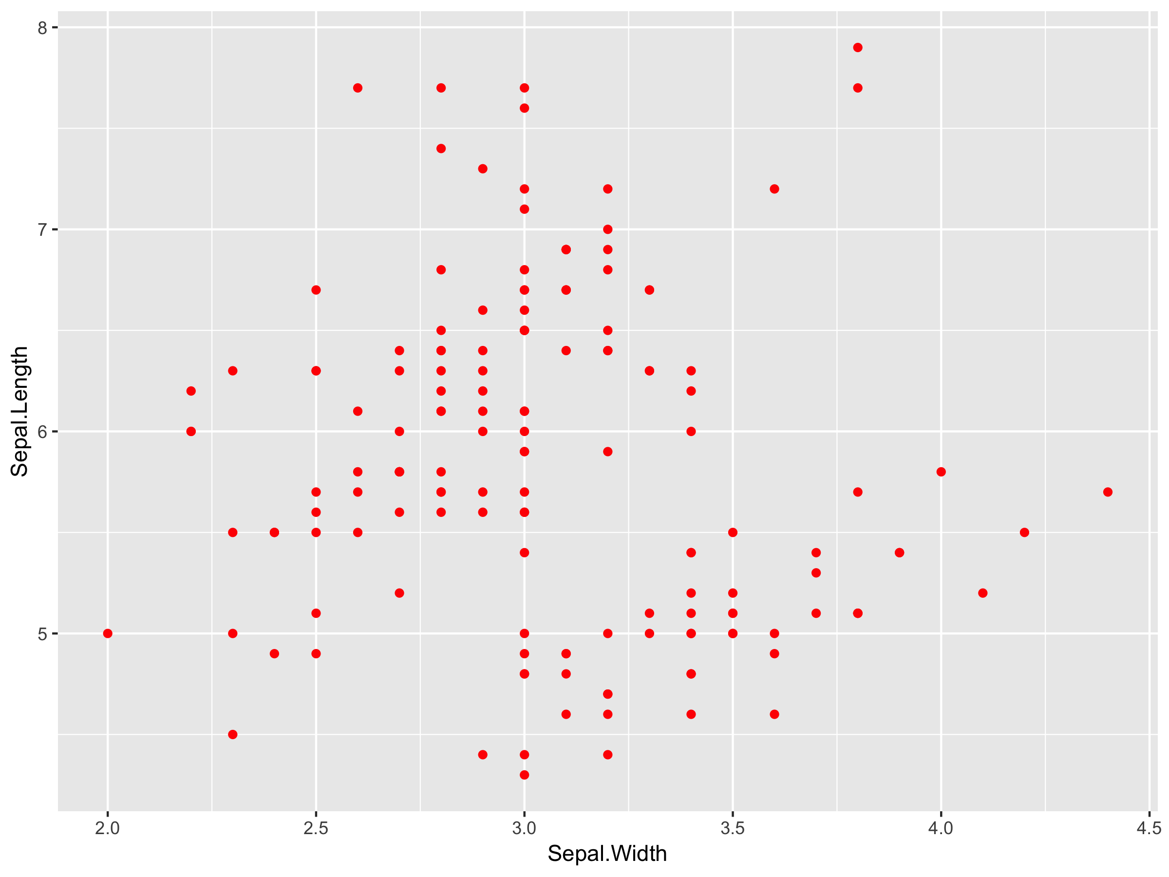
Specifically, we use the color attribute to change the color of any points and lines in your graph. This is because points and graphs are 0- and 1-dimensional objects, so they don't have any inside to fill!
library(tidyverse)

ggplot(iris) +
    geom_point(aes(x = Sepal.Width, y = Sepal.Length), color = 'red')
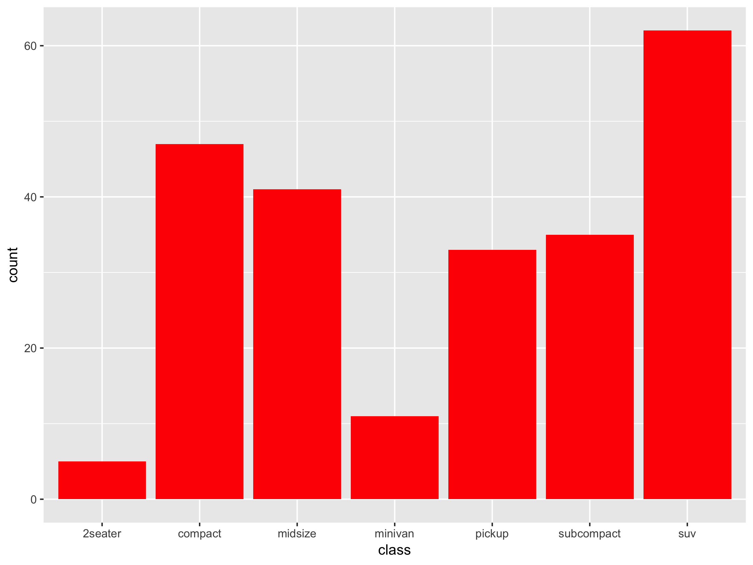
In contrast, bars and other 2-dimensional shapes do have an inside to fill, so you will be using the fill attribute to change the color of these items in your graph:
ggplot(mpg) +
    geom_bar(aes(x = class), fill = 'red')
Side note: technically you can also use the color attribute to change the outline of shapes like bars in a bar graph. I use this functionality very rarely, and for the sake of simplicity I will not go into this in further detail in this guide.
Except for the difference in naming, color and fill operate very similarly in ggplot. As you'll see, the functions that exist for modifying your ggplot colors all come in both color and fill varieties. But before we get to modifying the colors in your graphs, there's one other thing we need to touch on first.
Modifying ggplot colors: static color vs. color mapping
We need to distinguish between two different ways of modifying colors in a ggplot graph. The two things we can do are:
- setting a static color for our entire graph
- mapping a variable to a color so each level of the variable is a different color in our graph
In the earlier examples, we used a static color (red) to modify all of the points and bars in the two graphs that we created.
It's often the case, however, that we want to use color to convey additional information in our graph. Usually, we do this by mapping a variable in our dataset to the color or fill aesthetic, which tells ggplot to use a different color for each level of that variable in the data.
Setting a static color is pretty straightforward, and you can use the two examples above as references for how to accomplish that.
In the rest of this guide, I'm going to show you how you can map variables in your data to colors in your graph. You'll learn about the different functions in ggplot to set your own color palettes and how they differ for continuous and categorical variables.
Working with Color Palettes for Continuous Data
Let's start with a simple example of the default continuous color palette in ggplot. First, we'll generate some random data that we'll use for our graph.
df <- data.frame(
  x = runif(100), # 100 uniformly distributed random values
  y = runif(100), # 100 uniformly distributed random values
  z1 = rnorm(100), # 100 normally distributed random values
  z2 = abs(rnorm(100)) # 100 normally distributed random values mapped to positive
)
On sequential color scales and ggplot colors
When we map a continuous variable to a color scale, we map the values for that variable to a color gradient. You can see the default ggplot color gradient below.

This is called a sequential color scale, because it maps data sequentially from one color to another color. The minimum value will in your dataset will be mapped to the left side (dark blue) of this sequential color gradient, while the maximum value will be mapped to the right side (light blue) of this sequential color gradient.
You can imagine stretching a number line across this gradient of colors. Then, for every value in your data, you find it on the number line, take the color at that location, and graph using that resulting color.
Let's see how this works in practice. Using the random data we generated above, we'll graph a scatter plot of the x and y variables. To illustrate the color gradient, we'll map the z2 variable to the color aesthetic:
# Default colour scale colours from light blue to dark blue
g1 <- ggplot(df, aes(x, y)) +
  geom_point(aes(color = z2))

g1
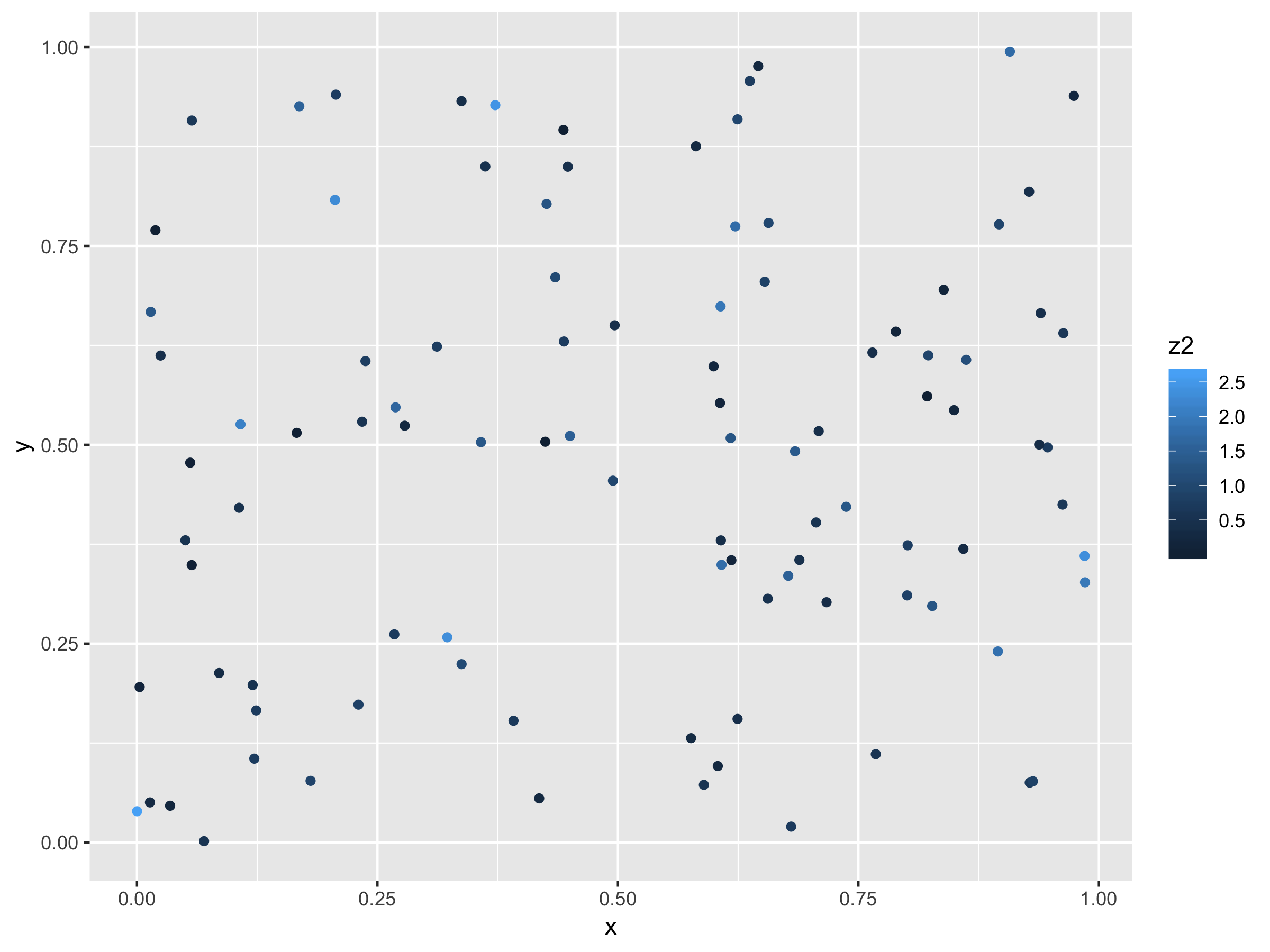
Note the contrast between this syntax and the syntax before where we set a static color for our graph. Here, we aren't specifying the color to use, we're simply telling ggplot to map the z2 variable to the color aesthetic by including the mapping color = z2 within the aes function.
In the dataset that I created, the minimum value for the z2 variable is 0.0024422, while the maximum value is 2.6241346. All values--and therefore all colors--fall between these minimum and maximum levels.
Modifying our ggplot colors for continuous data using scale_color_gradient
Now that you understand how ggplot can map a continuous variable to a sequential color gradient, let's go into more detail on how you can modify the specific colors used within that gradient.
Instead of the default blue gradient that ggplot uses, we can use any color gradient we want! To modify the colors used in this scale, we'll be using the scale_color_gradient function to modify our ggplot colors.
Side note: if we were instead graphing bars or other fillable shapes, we would use the scale_fill_gradient function. For brevity, I won't be including an example of this function. It operates in exactly the same way as the scale_color_gradient function, so you can easily modify this code to work for filling graphs with color as well.
Using the same graph from before, we simply add a call to the scale_color_gradient function to modify our color palette. Here, we can specify our own values for low and high to customize the gradient of colors in our graph. In this case, we'll be mapping low values to greenyellow and high values to forestgreen.
g1 +
  scale_color_gradient(low = 'greenyellow', high = 'forestgreen')
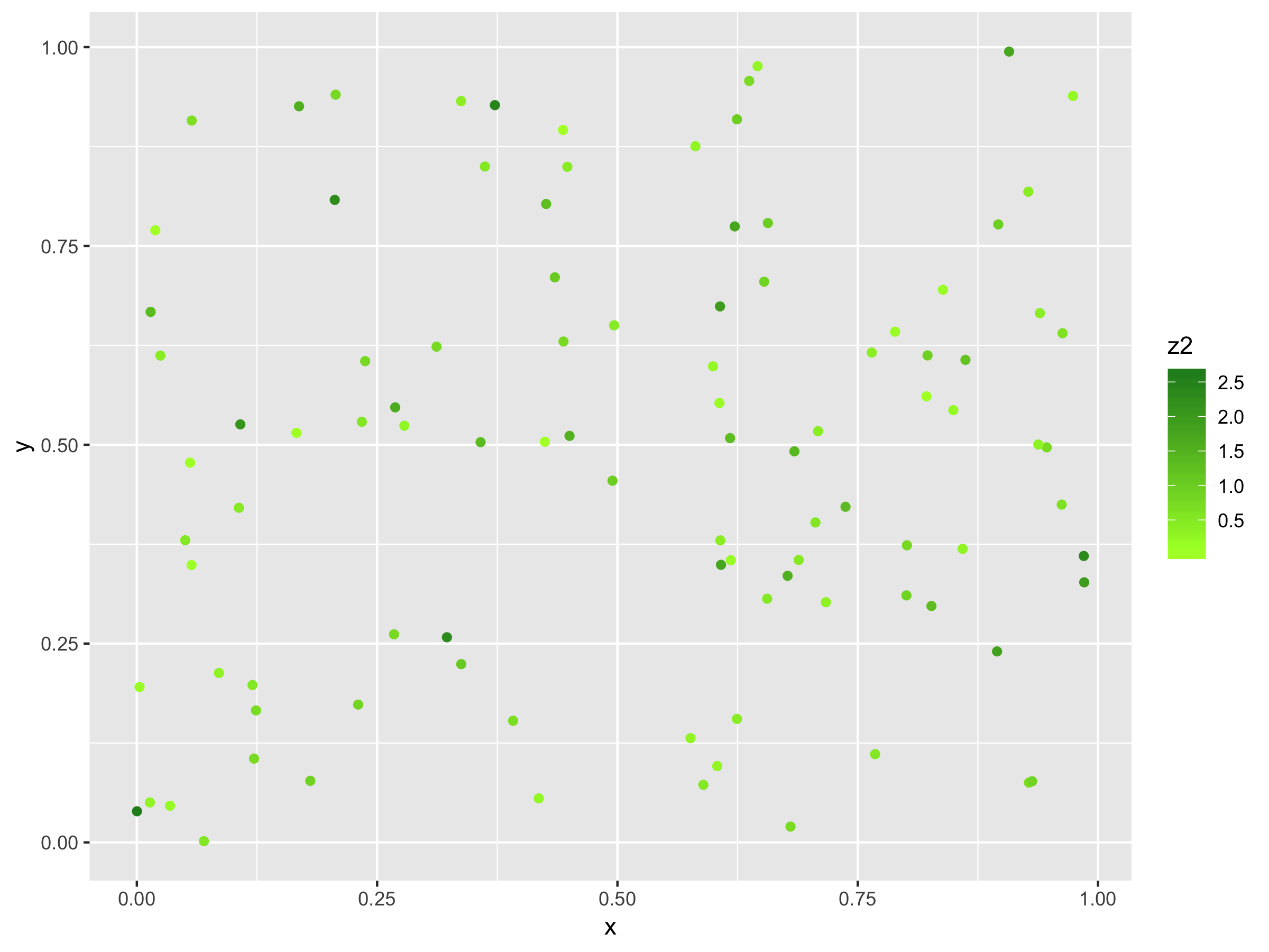
By modifying the values you're passing to the scale_color_gradient function, you can create a sequential color scale between any two colors!
Under the hood, ggplot was already using this color scale with the dark blue and light blue colors that show up by default. By adding this color scale to the graph and specifying your own colors, you're simply overriding the default values that ggplot was already using.
On diverging gradient scales and ggplot colors
Sequential color scales are great when you want to easily differentiate between low and high values in a dataset.
Sometimes, however, that's not what you want. Sometimes you want to look at deviations from a certain baseline value, and you care about distinguishing both positive and negative deviations. For this type of data, we use what's called a diverging color scale.
A diverging color scale creates a gradient between three different colors, allowing you to easily identify low, middle, and high values within your data. You can see an example of a diverging color scale below.

In this color scale, we see that blue is associated with values on the low end, white with values in the middle, and red with values on the high end. Among other things, this type of scale is often used when presenting United States presidential election results.
Instead of the scale_color_gradient function that we used for a sequential color palette, we're now going to use the scale_color_gradient2 to produce a diverging palette.
Side note: Again, there is a similar function called scale_fill_gradient2 that we would use if we were instead graphing bars or other fillable shapes. I won't be including an example of this function, but it operates in exactly the same way as the scale_color_gradient2 function, so you can easily modify this code to work for filling graphs with color as well.
As before, we tell the scale_color_gradient2 function which colors to map to low and high values of our variable. In addition, we also specify a color to map the mid values to. As in the color scale we just reviewed, we'll use the blue-white-red color palette for this example:
ggplot(df, aes(x, y)) +
  geom_point(aes(colour = z1)) +
  scale_color_gradient2(low = 'blue', mid = 'white', high = 'red')
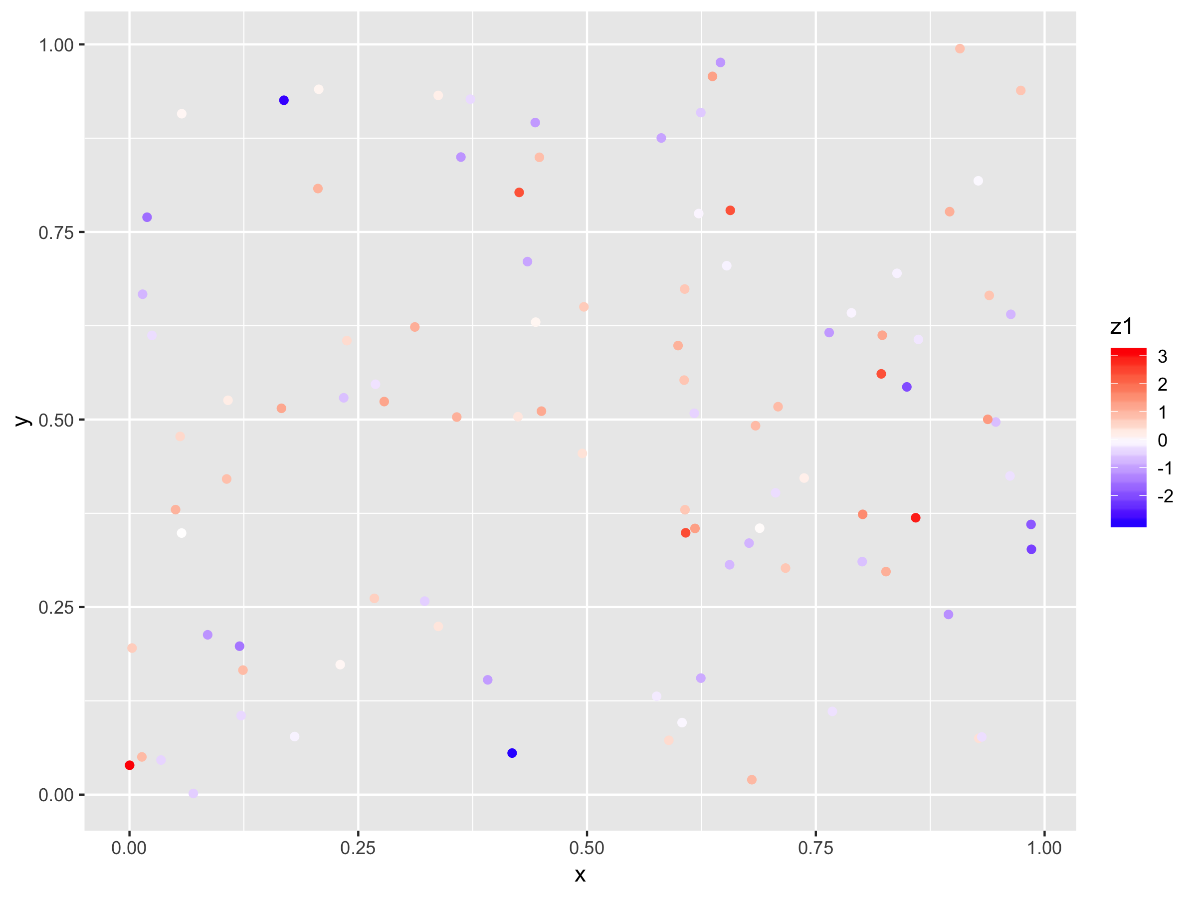
While you can technically specify any 3 colors for a diverging color scale, the convention is to use a light color like white or light yellow in the middle and darker colors of different hues for both low and high values, like we've done here.
Working with Color Palettes for Categorical Data
When working with continuous data, each value in your dataset was automatically mapped to a value on a 2-color sequential gradient or 3-color diverging gradient, as we just saw. The goal was to show a smooth transition between colors, highlighting low and high values or low, middle, and high values in the data.
When working with categorical data, each distinct level in your dataset will be mapped to a distinct color in your graph. With categorical data, the goal is to have highly differentiated colors so that you can easily identify data points from each category.
There are built-in functions within ggplot to generate categorical color palettes. That said, I've always preferred the control I get from generating my own, and that's what I'm going to show you how to do here.
My favorite tool for building categorical color palette: Color Picker for Data
My favorite way of generating beautiful color palettes is to use Tristen Brown's tool Color Picker for Data. It offers an intuitive visual interface to build and export a color palette that you can use directly within ggplot.
Mapping Categorical Data to Color in ggplot
For this example, we'll be working with the mtcars dataset. We're going to create a scatter plot of weight and miles per gallon. Then, we'll use the color aesthetic to map 4-, 6-, and 8-cylinder engines each to a different color using the default ggplot colors:
g2 <- ggplot(mtcars, aes(x = wt, y = mpg)) +
  geom_point(aes(color = factor(cyl)))

g2
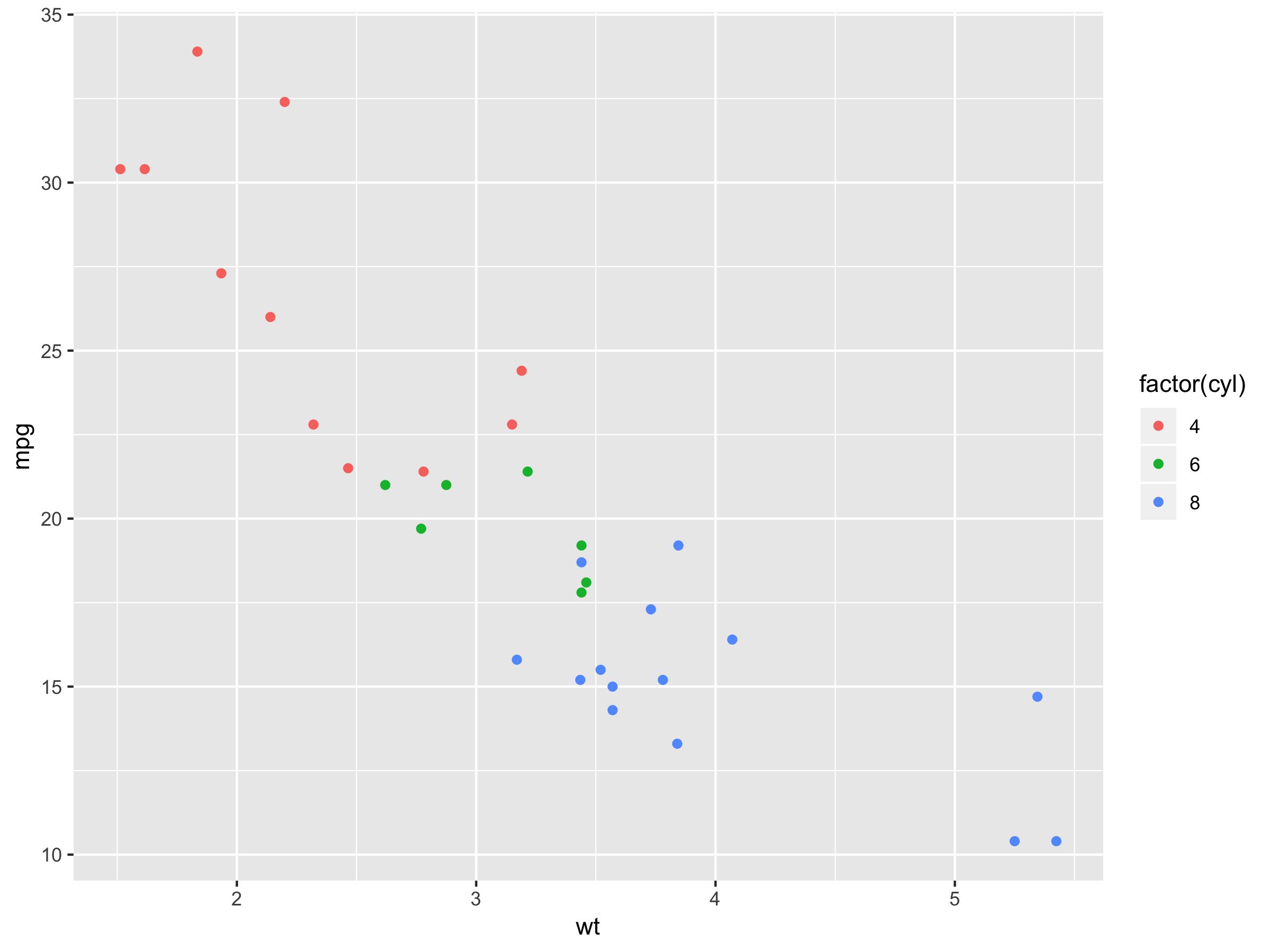
Similar to how we worked with categorical data, we simply map a variable to the color aesthetic by including the code color = your_variable within the aes function of our geom_point call.
The one caveat is that here we're converting the cyl variable to a factor before we do this mapping. Because cyl is recorded as a numerical variable, it will by default map to the color gradients we saw before, which isn't what we want in this case, as we're treating cyl as a categorical variable with 3 levels. Remember, just because a variable happens to have numeric values does not necessarily mean it should be mapped as a continuous scale!
We know how we can map a categorical variable to the color aesthetic to produce different colors in our graph for each level in our dataset. How can we modify those colors to a color palette of our choice?
Modifying our ggplot colors for categorical data using scale_color_manual
Once you have your color palette, you can use the scale_color_manual function to map the levels in your dataset to different colors in your generated color palette.
Side note: Can you guess? Yes, again, there is a similar function called scale_fill_manual that we would use if we were instead graphing bars or other fillable shapes. I won't be including an example of this function, but it operates in exactly the same way as the scale_color_manual function, so you can easily modify this code to work for filling graphs with color as well.
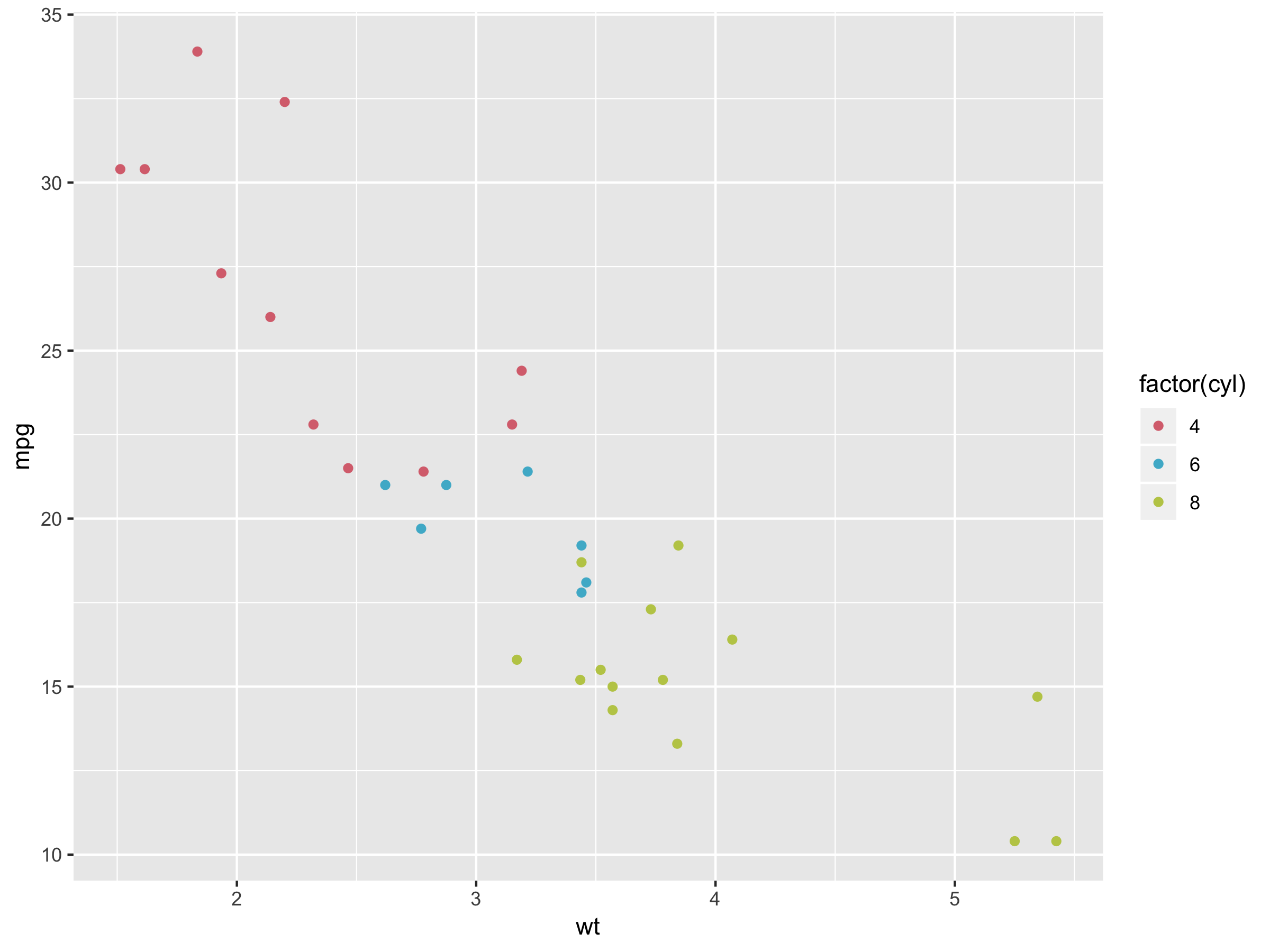
Here, we start by creating a vector that maps the different levels in our data, in this case "4", "6", and "8", to different colors.
We then use the scale_color_manual function and specify the mapping by passing our colors vector to the values argument of scale_color_manual. It will then go through each entry in the cyl column, mapping it to the relevant color in our colors vector.
colors <- c("4" = "#D9717D", "6" = "#4DB6D0", "8" = "#BECA55")

g2 +
  scale_color_manual(values = colors)
A Summary of Working with ggplot Colors
Congratulations! You know know how to work with colors in your ggplot graphs.
In this guide, you learned:
- How to change all items in a graph to a static color of your choice
- To distinguish between two ways of modifying color in your
ggplotgraph:- Setting a static color for all elements in your graph
- Mapping a variable in your data to a color palette so that each color represents a different level of the variable
- How you can customize your sequential color scales using the
scale_color_gradientandscale_fill_gradientfunctions for continuous data - How to customize your diverging color scales using the
scale_color_gradient2, andscale_fill_gradient2functions for continuous data - How to customize your color palettes for categorical data using the
scale_color_manualandscale_fill_manualfunctions
Don't Forget to Practice!
Right now, you should have a pretty good understanding of how you can work with and modify the colors in your ggplot graphs. But if you don't practice, you're going to forget this stuff!
That's why I've created a free workbook that you can use to apply what you've learned in this guide. The workbook is an R file that includes additional questions and exercises to help you engage with this material.
Get your free workbook to master working with colors in ggplot