You Need to Start Branding Your Graphs. Here's How, with ggplot!
Posted on Wed 27 February 2019 in R
In today's post I want to help you incorporate your company's branding into your ggplot graphs. Why should you care about this? I'm glad you asked!

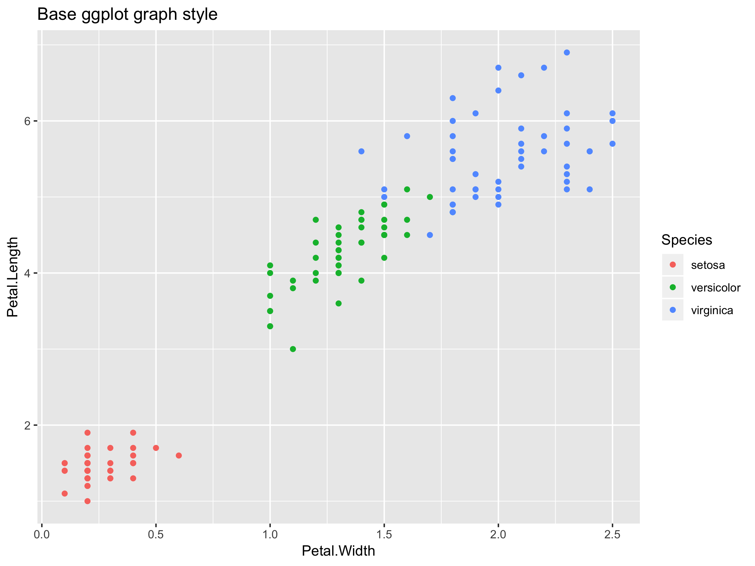
Have you ever seen a graph that looks like this? Of course you have! This is the default ggplot theme, and these graphs are everywhere. Now, look--I like the way this graph looks. The base ggplot theme is reasonable and the graph is clear. But it doesn't in any way differentiate it from thousands of other, similarly designed graphs on the internet. That's not good. You want your graphs to stand out! Take a look at this next graph:

I'm guessing, even before you saw the caption at the bottom, that you knew this was a graph from FiveThirtyEight, Nate Silver's data-driven news service.
How about this one?

Again, this graph is immediately recognizable as coming from the Economist magazine. These two companies have done exceptional jobs of creating branded, differentiating styles to make their graphics immediately recognizable to anybody who sees them. In this post, I'm going to convince you why it's important that you develop a branded style for your graphs at your own company, and then I'll show you some quick steps to do it.
Now, I know, You might be thinking: branding and visual identity is something for the design and marketing teams to worry about. You're a data scientist! You don't have those skills, and, frankly, you have more important things to do. I sympathize, but I'm going to be honest with you: you need to get that idea out of your head. It's easier than you think, and it's part of your job! Or, at least, it should be. You see, when you start to make YOUR work fit in with YOUR COMPANY'S work, doors start to open for you. You create more for cross-departmental and external facing opportunities when your work clearly matches the company brand. Maybe a graph you created can help the sales team put together a presentation to win a big client. Maybe the marketing team can use your work to help put together a press kit. These probably aren't the core focus of your job, but the more you help people around your organization, the more respected you'll be and the more opportunities you'll have.
Over time, you will build a reputation and be recognized for your quality work because your work will be VISIBLE. Pretty soon, you will be the go-to person when an executive needs a graph for a board presentation or an investor pitch. As you build more relationships throughout your company, you'll be able to direct your focus to work that you enjoy, get involved in interesting projects, and advocate for projects of your own. And the best part? Most of this is completely passive! You're already doing the work, these tips will just help you to make it more visible, more shareable, and more impactful!
Convinced? Okay, let's get started. This is going to be one of the easiest high-impact changes you can make, so I hope you're excited!
I'm going to show you how you can easily change the color palette of a graph and add your company's logo to create a final, branded image that's ready for publication.
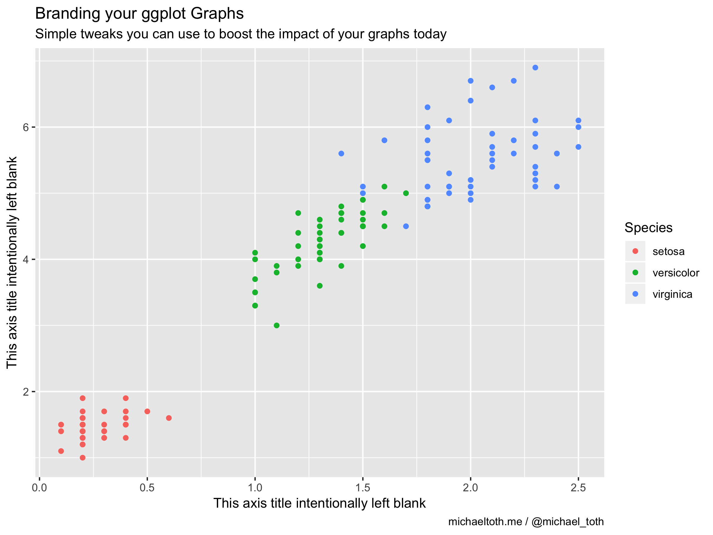
To start, create a standard ggplot graph like you otherwise would:
library(ggplot2)
library(hrbrthemes)
library(magick)

# Create a base graph, similar to what we had above
p <- ggplot(iris, aes(x = Petal.Width, y = Petal.Length, color = Species)) +
    geom_point() +
    labs(title = 'Branding your ggplot Graphs',
         subtitle = 'Simple tweaks you can use to boost the impact of your graphs today',
         x = 'This axis title intentionally left blank',
         y = 'This axis title intentionally left blank',
         caption = 'michaeltoth.me / @michael_toth')

p

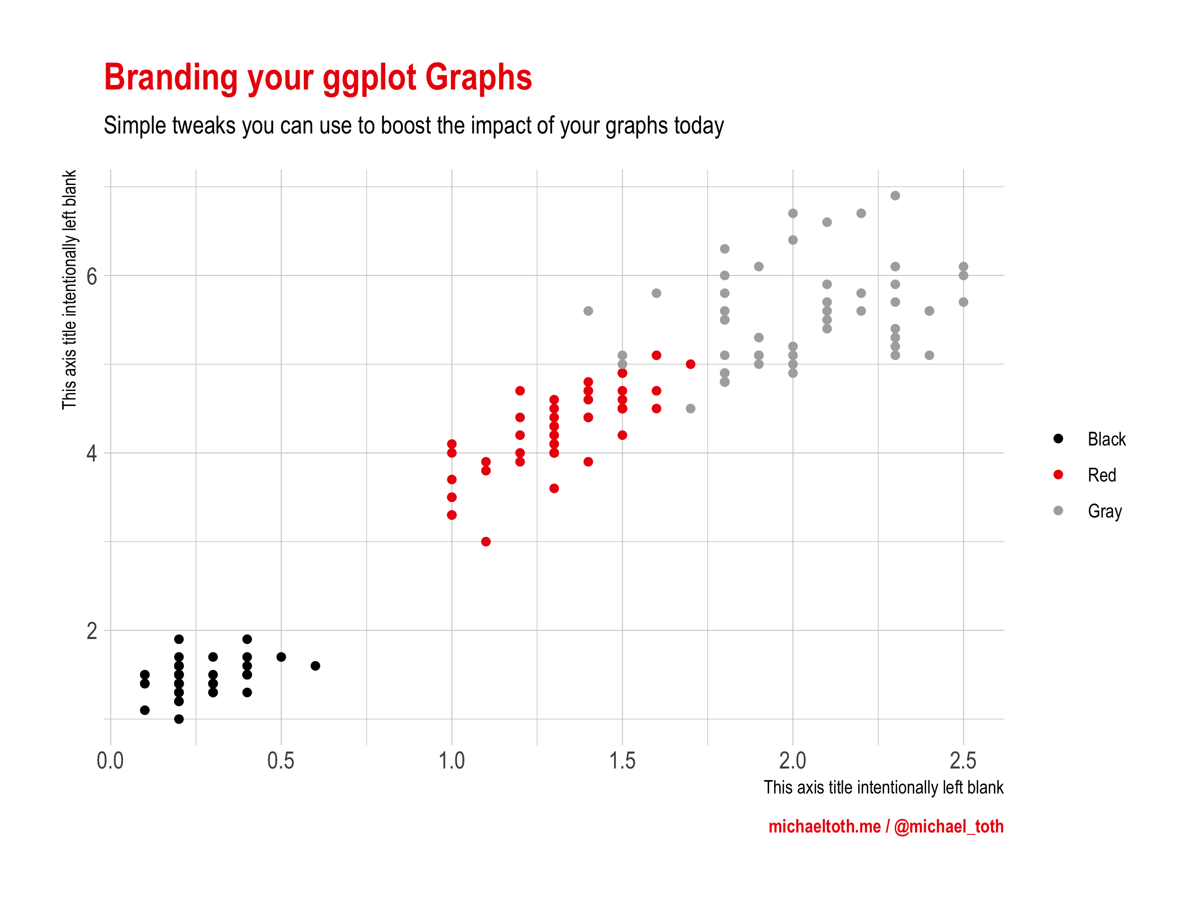
Once you have your base graph put together, the next step is for you to change the colors to match your company's color palette. I'm going to create a Coca-Cola branded graph for demonstration purposes, but you should substitute in your own company's details here. If you don't know what your company's color palette is, ask somebody from your design or marketing teams to send it to you! Here, I'm using red, black, and gray to match Coca-Cola's color palette.
Choosing individual colors like I'm doing here works for categorical graphs, but for continuous graphs you'll need to do a bit more work to get a branded color scale. That's a subject for another post, but check out the awesome Viz Palette tool by Elijah Meeks and Susie Lu for a sense of what's possible. As you become more familiar, you can create custom ggplot themes and ggplot color paletes to make this process seamless, but I don't want to get into all of that here, as it can be a bit overwhelming to learn all that at once.
# Customize the graphs with your company's color palette
p <- p + scale_color_manual(name = '',
                            labels = c('Black', 'Red', 'Gray'),
                            values = c('#000000', '#EC0108', '#ACAEAD')) +
    theme_ipsum() +
    theme(plot.title = element_text(color = "#EC0108"),
          plot.caption = element_text(color = "#EC0108", face = 'bold'))

p

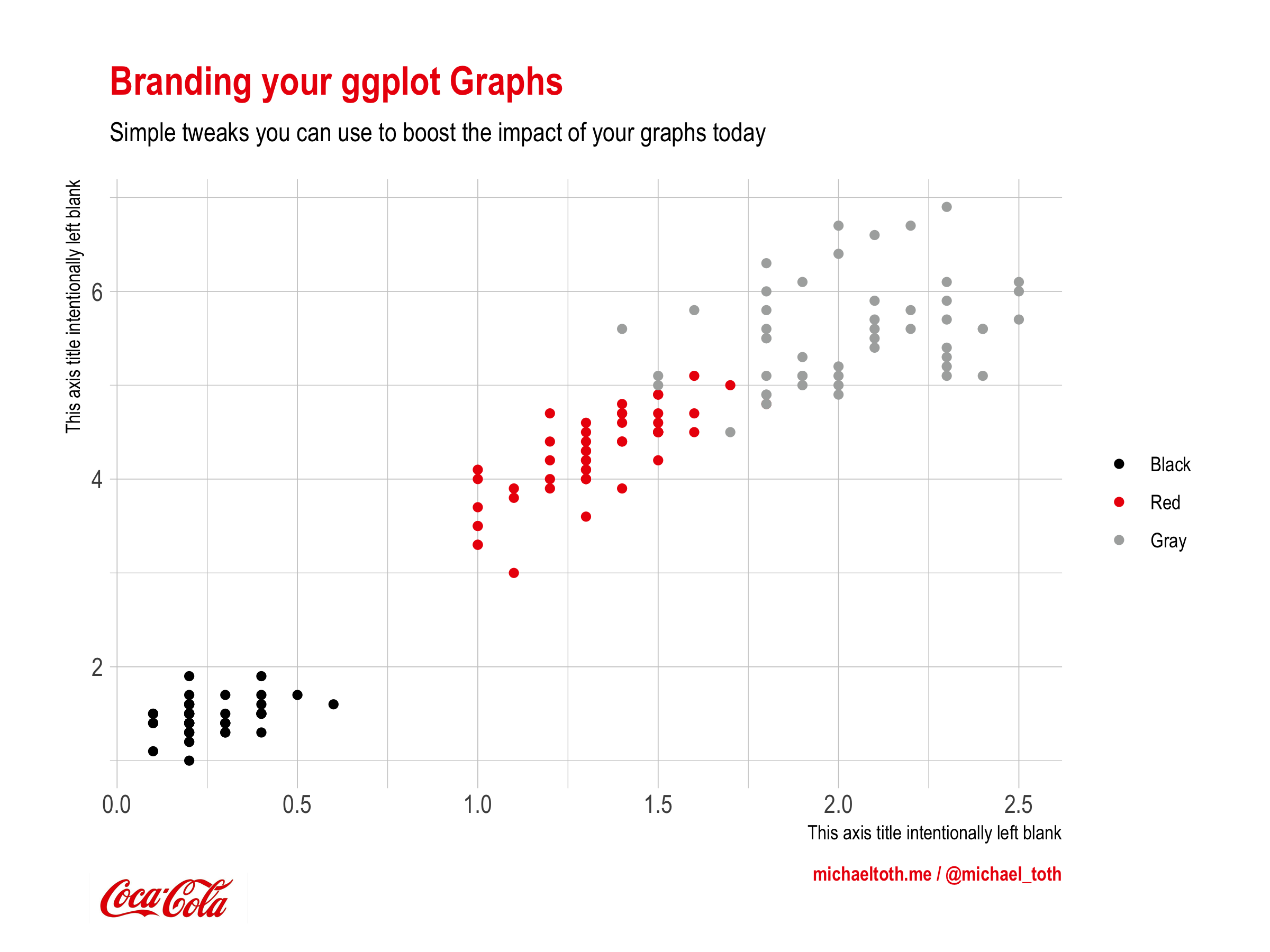
Finally, let's add your company's logo to the graph for a complete, branded, and publication-ready graph. Download a moderately high resolution logo and save it somewhere on your machine. The workhorse here is the grid.raster function, which can render an image on top of a pre-existing image (in this case, your graph). The trick is to get the positioning and sizing right. This can be a bit confusing when you're first starting with these image manipulations, so I'll walk through them one-by-one:
- x: this controls the x-position of where you place the logo. This should be a numeric value between 0 and 1, where 0 represents a position all the way on the left of the graph and 1 represents a position all the way on the right.
- y: this controls the y-position of where you place the logo. This should be a numeric value between 0 and 1, where 0 represents a position all the way on the bottom of the graph and 1 represents a position all the way on the top.
- just: this is a set of two values, the first corresponding to the horizontal justification and the second corresponding to the vertical justification. With x and y we chose a position on the grid to place the logo. just lets us choose how to justify the image at that location. Here, I've selected 'left' and 'bottom' justification, which means that the left bottom corner of the logo will be placed at the x-y coordinates specified.
- width: this scales the logo down to a smaller size so it can be placed on the image. Here, I'm scaling the logo down to a 1-inch size, but the size you'll want will depend on the size of the graph you've created. Play around with different sizes until you find one that feels right.
# Add your company's logo to the graph you created
logo <- image_read("~/dev/michaeltoth/output/images/logo.jpg")
p
grid::grid.raster(logo, x = 0.07, y = 0.03, just = c('left', 'bottom'), width = unit(1, 'inches'))

And there we have it: a branded graph that would be suitable for a sales meeting, marketing presentation, or investor deck!
Did you find this post useful? I frequently write tutorials like this one to help you learn new skills and improve your data science. If you want to be notified of new tutorials, sign up here!
I help technology companies to leverage their data to produce branded, influential content to share with their clients. I work on everything from investor newsletters to blog posts to research papers. If you enjoy the work I do and are interested in working together, you can visit my consulting website or contact me at michael@michaeltothanalytics.com!