Plotting the Evolution of the U.S. Treasury Yield Curve
Posted on Wed 12 November 2014 in R
Last week I came across a graphic that plots changes in the treasury yield curve from 1982 through 2012. For those unfamiliar, the yield curve shows the level of interest rates available to investors at a series of times to maturity or terms. I won't go into too much detail here, but for more information you may find the Yield Curve page on Wikipedia helpful. Note that while 20-year and 30-year treasuries are currently available, they were not available for this entire period and are therefore excluded from this analysis.
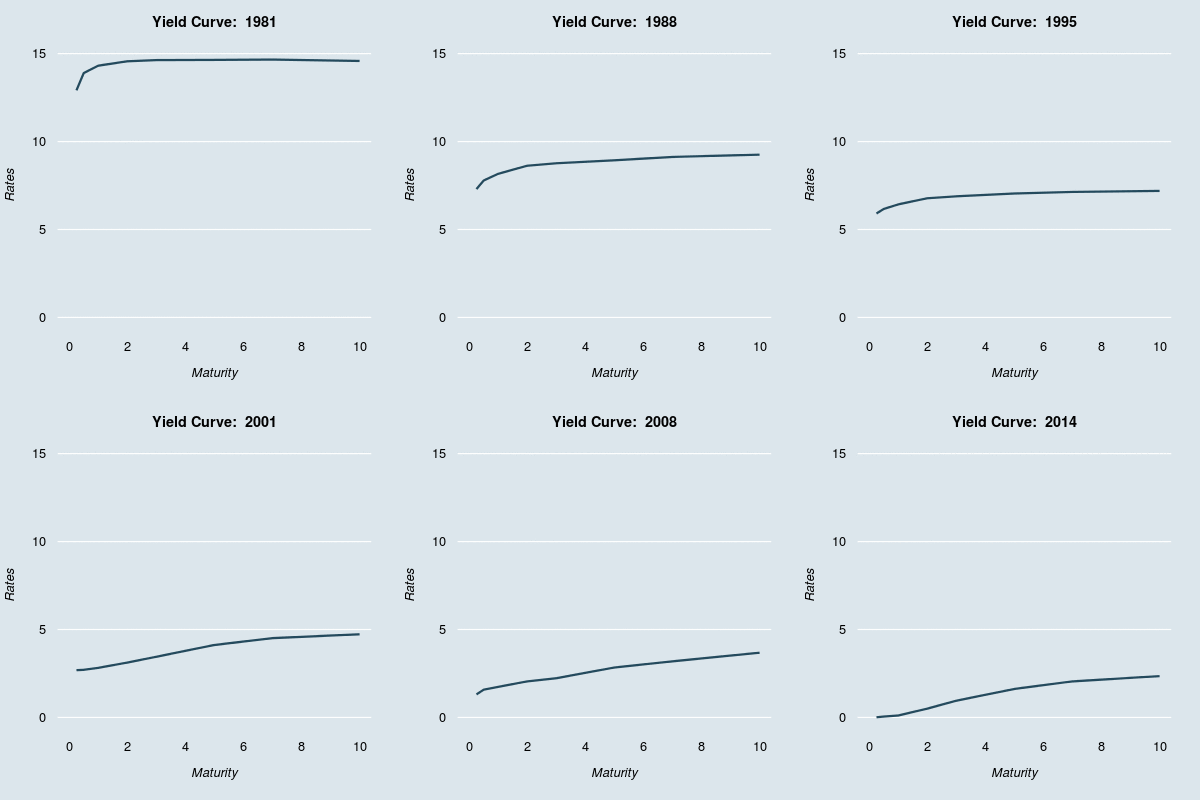
Building on the original plot mentioned above, I pulled post-2012 data directly from the treasury website and added it to the original data to produce an extended graphic of yield curve changes. I also updated the plot formatting and highlighted periods with inverted yield curves using a bright red line.

I've always liked graphics like this that show some changing feature over time, and I think the yield curve illustration is particularly informative. You can clearly see the extreme high interest rates that prevailed throughout the 1980s, and later the characteristically flat yield curve associated with the Zero Interest Rate Policy regime post-2008. The few yield curve inversions (referring to the situation where short term rates are higher than long term rates), are visible as well, highlighted in red. Yield curve inversions are generally thought to signal an impending economic decline, so highlighting these is informative. The plot also shows clearly that long-term rates historically are much less volatile than short term rates, but that the opposite has held true since 2008, with Federal Reserve action keeping short term rates near zero.
I've been experimenting with parameter and plotting settings in R, as part of the Exploratory Data Analysis Coursera class, and I thought this was a good opportunity to experiment with different options. I derived many of the ideas and aesthetics in these plots from examples in Flowing Data's Moving Past Default Charts post.
Technical Details and R Code
The FedYieldCurve data from the YieldCurve package only contains data through 2012. I wanted to expand the time history from the end of 2012 to current, so I pulled the additional yield curve data from the Treasury website. I downloaded the raw text data and subset/formatted on the command line before uploading the results to Google Drive. I then pull this information in using the fetchGoogle function from the mosaic package.
After converting the 2012-2014 data to .xts format and combining with the FedYieldCurve data, I modified the graphical parameters to make for a more interesting plot. Then, using the saveGIF function and a for loop, I was able to create the above GIF with a single frame for each month in the data series. Within the loop, I included an if statement to determine whether the 3M rate exceeded the 10Y point (inverted yield curve), and plotted these periods using a red line to highlight this.
I've included the complete R code below. You can also access the code on Github
library(YieldCurve)
library(animation)
library(lubridate)
library(XML)
library(mosaic)

# Getting yield curve data through 2012
data(FedYieldCurve)

# Pull 2013 and 2014 data separately from Google Docs (Source U.S. Treasury)
end_curve <- fetchGoogle("https://docs.google.com/spreadsheets/d/1Yc3Og9g0Ko_SMh6l0EEZcqIQ85godDxgpnkbfK_N-Gk/export?format=csv&id")

# Change formatting to xts and combine with FedYieldCurve data
end_curve$Date <- as.POSIXct(as.character(end_curve$Date), format="%m/%d/%Y")
end_curve_xts <- xts(end_curve[,2:9], order.by = end_curve$Date)
final_curves <- rbind(FedYieldCurve, end_curve_xts)

maturities <- c(3/12,6/12,1,2,3,5,7,10)
numloops <- nrow(final_curves)

# Set graphical parameters
par(bg="#DCE6EC", mar=c(5,4,3,2), xpd=FALSE, mgp=c(2.8,0.3,0.5), font.main=2,
    col.lab="black", col.axis="black", col.main="black", cex.axis=0.8,
    cex.lab=0.8, cex.main=0.9, family="Helvetica", lend=1,
    tck=0, las=1, bty="n")
opar <- par()

# Note: must install ImageMagick program for saveGIF function to work
saveGIF({
    # Create one panel for each date
    for (i in 1:numloops) {
        par(opar)
        plot(0, 0, type="n", xlab=expression(italic("Maturity")),
             ylab=expression(italic("Rates")), ylim=c(0,15), xlim=c(0,10),
             xaxt="n", yaxt="n")
        title(main=paste("Yield Curve: ", year(time(final_curves[i]))))
        grid(NA, NULL, col="white", lty="solid", lwd=1.5)
        axis(1, tick=FALSE, col.axis="black")
        axis(2, tick=FALSE, col.axis="black")

        # If yield curve is inverted, plot in red, else dark blue
        if (final_curves$R_3M[i] > final_curves$R_10Y[i]) {
            lines(maturities, final_curves[i,], lwd=3, col="red")
        }
        else {
            lines(maturities, final_curves[i,], lwd=3, col="#244A5D")
        }
    }
},
interval=.1,
movie.name="yieldOutput.gif",
ani.width=400,
ani.height=400)