Popularity of Baby Names Since 1880
Posted on Sun 20 November 2016 in R
A while back I spent some time figuring out how to serve interactive shiny apps through my website, but I haven't had a chance to build anything until recently. I set out to create a few simple shiny apps in R that I could use as a sort of test run, and I'm writing those up here.
In this post I'm going to be analyzing some open data provided by the Social Security Administration on the popularity of baby names over the years--specifically, since 1880. Data comes from the Social Security Administration
In the application below, you can view the 10 most popular baby names for any year since 1880, either for males or females. You can also click the play icon directly below the year slider to view an animated history of the most common names.
In the next application, you can enter any name, and the graph will display how the popularity of that name has changed over time. Be sure to also select whether the name is for males or females, or you'll likely see some unexpected results!
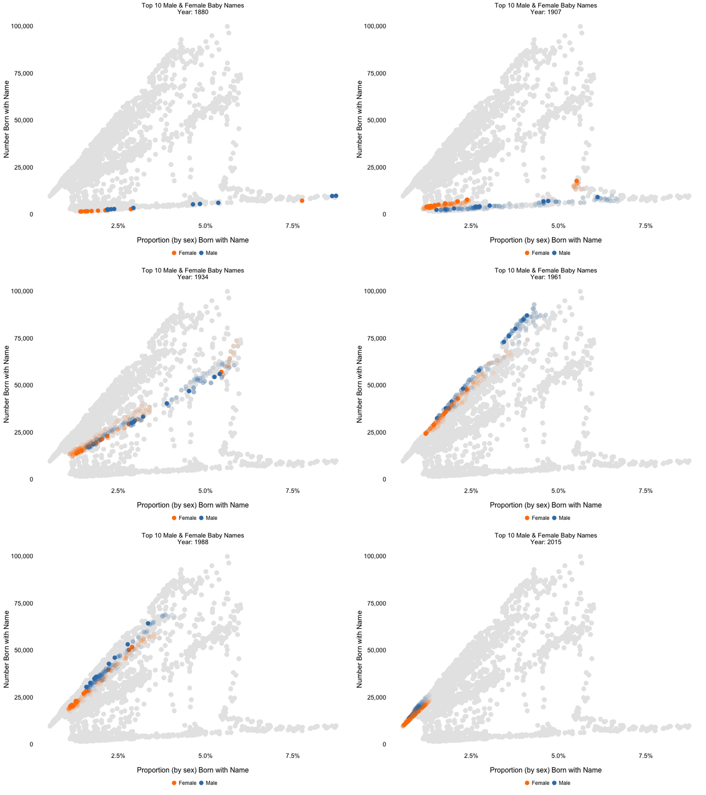
After building the shiny applications above, I got interested in whether I could identify any meaningful trends over time in the data. I wanted to see whether the concentration (the proportion of babies born with a given name) of the most popular names was relatively static over time, or whether this fluctuated. I was also interested in finding trends in the number of babies born with each of the most popular names. To investigate these, I used a subset of the original data, grabbing the 10 most common male and female names for each year since 1880. I went through several iterations of how best to display the data, and ultimately arrived at the graph below, which I quite like.
I was excited that this project gave me an opportunity to make use of David Robinson's gganimate package, which I must regrettably admit I hadn't had a chance to experiment with previously. For those unfamiliar, this package makes it incredibly easy to create animated ggplot graphs, and it's awesome!
I wanted to create some kind of trailing visualization to make it clear how patterns and trends were changing over time. The implementation here was adapted from Thomas Pedersen's example which he used to produce this image.
In the graph below we can use the trailing effect to easily identify trends that occur over a series of years. The grey background data also helps us to visualize how any given year compares with the overall history. I see 5 key periods present themselves in the data:
- Early Years (1880 - 1910): This period is characterized by a low number of babies born (due to the much lower population at this time) as well as a high concentration of the most popular names, in some cases reaching almost 10%. This means that the most common names were being used by a very high percentage of the population during this period. Toward the end of this time period, we begin to see declines in the concentration statistic.
- World War I Years (1910 - 1920): In this period we see an explosion in the number of babies born with the most popular names. We don't see much change in the concentration of names over this period.
- Intra-War Period (1921 - 1940): In this period both the number and the concentration of births is remarkably consistent, with almost no changes on a year-over-year basis.
- WWII & Baby Boom (1941 - 1957): In this period we again see a huge increase in the number of babies born, corresponding to the well-known baby boom that occurred in the post-WWII years. We actually see this increase beginning during the war, in 1941. We also see a slight decrease in the concentration of the most popular baby names during this period.
- "Modern" Era (1958 - 2015): This period is characterized by a steady decrease in both the concentration of the most popular names and in the number of babies born with those names. Though overall birth rates did begin to decline in recent years, this change is not due primarily to a decline in birth rates, but rather to an increased equity in the popularity of names, which means that the most popular names make up a much smaller percentage of overall births.

The code for this image is available below:
library(dplyr)
library(ggplot2)
library(gganimate) #devtools::install_github("dgrtwo/gganimate")
library(readr)
library(scales)

# Load pre-processed data. For additional details check Github below
top_10_each_year <- read_csv('input/top_10_each_year.csv')

# Create fading animation effect by replicating the data frame and adding an exponentially decaying fade parameter to previous years
anim <- lapply(1:10, function(i) {top_10_each_year$year <- top_10_each_year$year + i; top_10_each_year$fade <- 1 / (i + 2); top_10_each_year})
top_10_each_year$fade <- 1
top_10_with_fade <- rbind(top_10_each_year, do.call(rbind, anim))
top_10_with_fade <- filter(top_10_with_fade, year <= 2015)

p <- ggplot(top_10_with_fade, aes(x = proportion, y = count)) +
    geom_point(color = '#e6e6e6', size = 4) +
    geom_point(aes(color = sex, frame = year, alpha = fade), size = 4) +
    ggtitle('Top 10 Male & Female Baby Names\nYear:') +
    xlab('\nProportion (by sex) Born with Name') +
    ylab('Number Born with Name') +
    scale_color_manual(name = '', values = c('#ff7f00', '#377eb8'), labels = c('Female', 'Male')) +
    scale_x_continuous(labels = percent) +
    scale_y_continuous(labels = comma) +
    scale_alpha(guide = 'none') + # Remove alpha legend from plot output
    theme_bw() +
    theme(panel.border = element_blank(),
          panel.grid = element_blank(),
          axis.ticks = element_blank(),
          legend.key = element_blank(),
          legend.position = 'bottom',
          axis.text = element_text(size = 14),
          axis.title = element_text(size = 16),
          legend.text = element_text(size = 12))

gg_animate(p, filename = 'yearly-birth-names-with-trails.gif', interval = 0.2, ani.width = 800, ani.height = 600)
For the full code behind the shiny applications and the animation produced above, check out my Github